 The following story is yet another classic from the canon of stories that typifies the second golden age of Warren comics. Doug Moench who had been active in comic fandom since the age of fifteen was one of Warren's busiest rising young stars. He'd been an avid reader of 'Famous Monster of Filmland' and latterly Creepy and when he thought of pitching a story beyond the confines of fanzines, he set his sights on the offices of James Warren as his ideal first port of call.


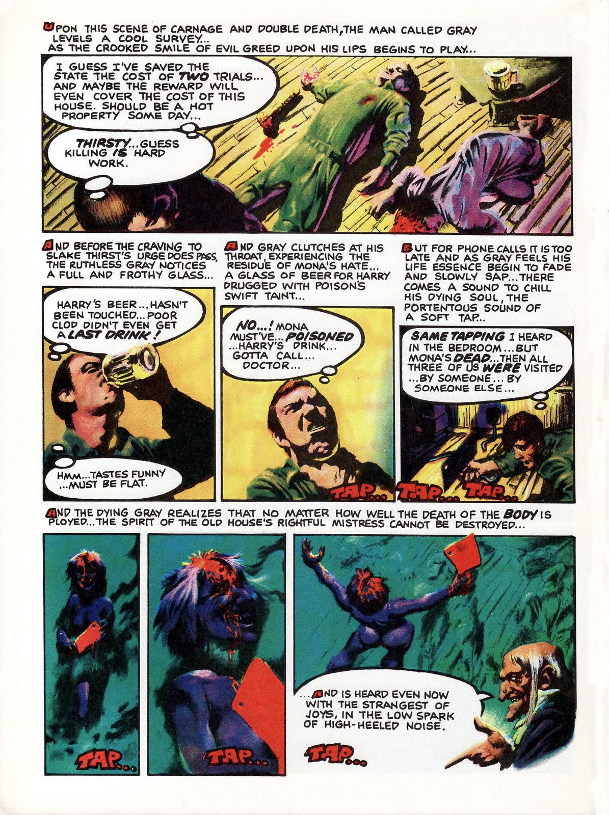
Although Moench had no say which artist would be assigned to his Warren stories, he always regarded Richard Corben as one of his ideal visualisers and you can see why in this take on the travelling salesman (modelled on Corben himself), the weird old house, and it's dysfunctional inhabitants.


I must admit that Moench was never one of my favourite scripters: he was far too prolix for my taste, and I really hated his dialogue. Unlike some others who were just plain bad, however, he was always capable of surprising me every now and again with an absolute gem of a story which indicated that if he'd written a bit less prolifically he might have been a much better writer.
ReplyDeleteHappily, nearly all his collaborations with Richard Corben fell into the latter category (as did the work he produced with Paul Gulacy), which raises the intriguing possibility that some of his less successful Warren scripts might have actually suffered from being interpreted by foreign artists via substandard translations. In the Twomorrows interview, for example, Moench frankly admits the trepidation he felt whenever someone like Esteban Maroto was let loose on one of his stories - anticipating that it'd look beautiful but make no sense at all!
Yes indeed, Phil. I thought I had a tendency to be a bit wordy, but I hope that if I ever got to work with Corben that I'd have the sense to sit back and let his art carry the story. Having said that, Moench's text-heavy style was absolutely perfect for that emo classic The Hands of Shang-Chi.
ReplyDeleteI've had a few emails today from my friend Simon pointing me in the direction of Kung Fu Classics by Doug and Paul Gulacy.
ReplyDeleteBut apropos of Spanish artists working on U.S. scripts here's one classic anecdote from Doug:
(The comic in question was Marvel's 'Monsters Unleashed' and the srtist in question was Vincente Alcazar.)
"My panel instruction was, "Scientists at basin washing out a test tube." The panel showed the rear end of a dog sticking out of a tipped over garbage can in an alley. Now how my words got translated into that I have no idea, but it's just like, "Wow, what, is 'washbasin' and 'garbage can' ...? 'Test tube' and 'dog'? I don't know! That's the most extreme example I can point you to, but things like that happened all the time! The translation was terrible!
Oddly enough one of my all-time favourite Moench scripts has to be his adaptation of Larry Niven's "Not Long Before the End" for an issue of Marvel's excellent (if short-lived) B&W magazine 'Unknown Worlds of Science Fiction', the artist for this being none other than...Vincente Alcazar!
ReplyDeleteApparently Fleetway had similar problems with foreign artists in producing their War Libraries; fortunately they had in-house art-assistants who were able to make any necessary alterations to the artwork before it was sent to the printers. One such bodger was Roy McAdorey who recalled: "One occasion which caused a laugh with us was when a Spanish artist doing a Battler Britton story was instructed to show Battler in the officers' mess wearing evening dress with a bow tie; when the artwork came back, Battler had an archery bow tied to his shoulder and was wearing a quiver of arrows!" :-D
Regarding the Moench/Gulacy partnership it's worth mentioning that in addition to MOKF they also collaborated on a memorable three-part story called 'Blood on Black Satin' for Eerie 109-111.
Doug Moench and Mike Ploog changed my life when Planet of the Apes #6 (the black and white magazine) fell into my eight year old hands.
ReplyDeleteThey had reproduced that story directly from Ploog's pencils and I saw it as quite the masterpiece!
Here's another one of my daft analyses, but... I like how the shadows and silhouettes are an opposing colour, eg. the house in the first page is yellow and orange on the front but with light blue and purple shadows behind it. I ought to try something like that in my art sometime. BTW, I have some storyboards and things up on my blog now. :)
ReplyDelete