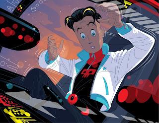
Thursday 30 December 2010

Work In Progress - The Wonders of Illustrator! Part 3

I'm fascinated with the idea of posting occasional work in progress reports on the job that I am currently involved in as it has some interesting challenges, not the least of which is that the writing which underpins this series of stories is so unresolved that it places the illustrator in the position of being obliged to make some visual compensation for the holes in the plotting.


As mentioned earlier the stories are aimed at 15 - 16 year old slow readers and to a certain extent there is a slight feel of writing down to this audience in these scripts. The text is deliberately kept simple, but the team I am working with are a delight and are so far (fingers crossed) receptive to the idea of making these books as attractive as possible to teenagers, who aside from their reading impediments are otherwise like all other teenagers in a state of having their brains re-wired while their hormones are coursing through their veins like the lava flows of Mount Etna.

So I've sold the idea of Manga Goth (toes crossed and fingers crossed). But there are lots of glicky bits with the text. In the first book we have a pyro maniac super villain by name of Scorcher and in a matter of a few spreads he comes and sets fire to the teams crops. They ... erm live in a secret base in the desert, where they ... ermmmmm ... protect the world from super villains and grow crops - of course!

So in one scene we have them checking the touch screen computer to check on who's coming for them this time ... Scorcher - of course!!! Next scene they're rushing out to see what that naughty old Scorcher is up to and By George!!! He's setting fire to their crops. Next scene, he's setting fire to one of the heroes (that's the scene previously posted with an urban backdrop - done as a sample before I had the full brief, hence the continuity lurch).

Then comes the headache scene - suddenly they have a water cannon which they're aiming at their chum to douse her before turning the cannon on Scorcher, whose face begins to burn with the effects of the water before he flies off (God help us - I'm going to have to talk them around to a slightly better super villain exit as well).

There is a golden rule in all story telling that if you are going to have any kind of device that the plot hinges on you need to plant it in the reader's/ viewer's mind before you actually use it. Water cannons don't suddenly appear out of thin air, there has to be some logical reason why such a device would be accessible.

Problem fairly simply solved as each story commences with an aerial view of the team's base. The author's directions for what needs to be there are merely restricted to a few items that appear in the books. So we get the base with it's flat roof and observation tower, plus disused mine shaft, plus crops.

No mention of  necessities such as a generator, grain silo, sheds with farm equipment or the most obvious requirement of the lot  - a water tank and ...

Sprinkler system with cannon sprinkler.

Problem solved (just hope the team agree).

Here's the previous artwork now completed, plus the problematic spread which I am happily breaking up into comic panels as two images on this one just won't work.

Christmas Reading - "Tomorrow Revisited"

I must apologize for come over a bit tub thumperesque with yesterday's blog. There is a golden rule which needs to be adhered to as much in cyberspace as around the dinner table and that is conversation and ideas are always welcome, but please no sex, religion, or politics. Because that way leads to treading on other people's feelings and personal persuasions, but apropos of the media and the way we are constantly misled by journalists focusing more on their own career advancement inside huge corporations rather than the story they should be covering I felt a little food for thought might not be totally inappropriate.


Anyway apologies to those of you who thought otherwise.

Now then on to ideas for post Christmas blow out reading as you lie there like a beached whale wondering what to do next. It has been my pleasure to read from cover to cover a truly stupendous book which appeared a couple or so weeks ago. Going under the title of "Tomorrow Revisited" this book by Alastair Crompton examines the events that in the aftermath of World War Two led the artist Frank Hampson and the clergyman The Reverend Marcus Morris to create what has long been regarded as one of Britain's finest comics, The Eagle and the character that inspired millions of readers to dream of space flight and a better and brighter tomorrow - one Colonel Dan Dare.

The book is essentially a rewrite of Crompton's earlier telling of this tale, "The Man Who Drew Tomorrow". This book published in 1985 very shortly after Frank Hampson's death was as Crompton himself puts it, very much a hagiography, albeit a truly compelling read. The problem with the earlier book is that Crompton who had assiduously courted Hampson as regards gaining his co-operation and involvement with the project received polite and then finally brutal rejection from his subject.

The reasons for this are what makes both books such engaging reads, the advantage that the second book enjoys, is that Crompton spent the intervening years between his first attempt to set the record straight assembling the necessary information. Information which reveals a lot more of the machinations that led to the destruction of all of Hampson's hopes and ambitions. Unlike his previous book, the account doesn't shy away from considering Hampson's own responsibility for laying the foundations for what was a truly ruthless severance of an artist from his creation.

The other advantage that this book enjoys over it's predecessor is the lavish quantity of color images from Hampson's years as artist in chief of Dan Dare. In addition to the artwork and photos that so fulsomely flesh out Crompton's text, there are some truly fascinating cutaways by artist Graham Bleathman of both the old Bakehouse and Bayford Lodge Studios, which adds further insight to this fascinating story.

All in all a must have book!

Published by PS Publishing and available direct from them or via Amazon this beautifully designed book is just a mouse click away.


Saturday 25 December 2010

Merry Christmas

Courtesy of my number one fellow duck devotee Simon, comes this image created by Carl Barks. One of a series of oil paintings that he created for fans of his duck stories after his retirement from twenty five plus years working for Western Publishing.

Thursday 23 December 2010

Work In Progress - The Wonders of Illustrator! Part 2

We're into the festivities with friends and family arriving, food being prepared, presents wrapped, Christmas Tree being erected and consequently routine is out the window.


So I thought I'd post an update on the image that I posted yesterday. Normally I would expect to complete an image like this in two days - three days mega-max, but with my fractured timetable that isn't possible. So making the most of this opportunity I thought I'd just do an update on where the illustration is going.

I'm hoping that I'm going to have the publisher on board with this. I did one upfront illustration (the one of the girl being hit by the fireball on yesterday's  post) to secure the job and let everyone see where we were going in terms of styling and content. The stories are wildly fanciful and aimed at slow readers aged 15-16 and centered around a team of teenage heroes who have no super powers but are cool and resourceful. Bearing in mind the market that these books are aimed at I pitched the idea of Goth Manga which the editorial team responded to with enthusiasm - so fingers crossed that they don't suddenly remember that they need to do a Saudi Arabian co-edition - because then I am totally effed.

So here are the team so far, the action to the left is a molten fireball, the rest of the image is reflecting (literally) the fact that they are looking at a green screen.

The second image shows one layer knocked out so you can see the shadow layer. Golden rule is keep the shadow shapes simple as there is already a lot for the eye to engage with.

The perspective on the foreground girl's hand is amplified by heightening the contrast between the colors on her outstretched arm and hand. Again just keeping it simple.

Wednesday 22 December 2010

Work In Progress - The Wonders of Illustrator!

I'm currently juggling creating pages for Cloud 109 with a fairly hefty publishing job. Although it falls into the educational publishing arena, the client and team I'm working with are very encouraging and seem to be up for the illustrators involved to do their own thing as regards styling.

The books concerned are aimed at 15-16 year olds who are slow readers. The idea is to create images that will entice them to engage with the very straightforward texts and having created some trial images, I've actually (I hope/pray) got them on board with Manga stylings with a Goth subtext.

As some of you will be aware I do the bulk of my work in Illustrator working on top of very loosely drawn visuals created in Manga Studio Debut. The beauty of Illustrator is that as a vector based drawing tool it is always alive and receptive to change and manipulation, unlike Photoshop which is a bitmap program is not nearly so manipulable.

One of the many facets of Illustrator is that no matter how large you magnify the artwork on screen, it is still razor sharp no jaggedy bits at all - No Siree!


Here's some samples of work in progress.


Tuesday 21 December 2010

"The Innocents" A Vintage Chiller

Martin Scorsese ranks "The Innocents" as one of the eleven scariest films of all time, and I have to admit that for me it's up there with "The Shining" and "The Woman in Black" as one of those films that I have to psych myself up to watch. There are certain scenes that just in the anticipation of seeing again give me the heebie jeebies.

Directed by Jack Clayton, it is a masterly adaptation of the Henry James novella  A Turn of the Screw. Centering around the concerns of a governess that the two children in her charge are being "turned" by the evil spirits that seem to inhabit Bly, the country estate where the plot unfolds with a truly creepy relentlessness.

The scripting credits on this film are a veritable who's who of recent literati, for in addition to James as plot weaver, there is also the hand of Truman Capote who reworks copious amounts of William Archibald's Broadway adaption along with a young John Mortimer who handles the additional scenes.

Here's just a brief excerpt, and as you can see even though the sun is shining and all the traditional Gothic props are conspicuous by their absence, this still makes for decidedly unnerving viewing.


The whole film is available on YouTube in eleven easy pieces - unfortunately somewhat compressed in terms of ratio.

Sunday 19 December 2010

Dark Days and Nights

I am what is sometimes referred to as a silver surfer, i.e. old fart with internet access and one of those irritating baby boomers who grew up in those halcyon days when the establishment just loathed rock music. "To think we fought a war for you lot and this is what you listen to...etc, etc"

Yes in those days we were free to enjoy cool stuff - on our own. Now all my generation have grown up and their still listening to the friggin' stuff. I thought we might get sensible and start listening to proper music but clubs and pubs are still packed out with sad old farts with tattoos and Cramps T-Shirts, going ga-ga with the music that they're parents wouldn't let them listen to.

And if that's not bad enough you've got the broadsheets and the flippin' BBC telling you what is cool, oh yes and what's going to be really big next year.

It's all too safe and processed and it's killing what rock music should be.

... a bit of edge

... a bit of danger

Anyway while all my contemporaries are wittering on about Eric Clapton's latest release, or what old Planty has been up to, here's something with a bit more night than Patch William or the Mumfords:


Dark Days and Nights is just one of 10 killer tracks from the Insect Guide's new album of the same name - available from the guys at Squirrel Records.

It's also climatically topical as is my current chilling and utterly unputdownable read:

Thursday 16 December 2010

My Favourite Ever EC Christmas Story

I know, I know - I ran this thing last Christmas but it is just so exquisite as well as being a really nostalgic and admittedly self indulgent trip down memory lane. The first time I encountered Johnny Craig's "...And All Through The House" was in a scruffy copy of the Bantam paperback collection of EC reprints under the title Tales From The Crypt, complete with Frazetta cover.

All eight of the stories were cut up so that each tier appeared sideways on necessitating the reader to rotate the book 90' to the left. But the format worked and the stories were printed in black and white, no distraction with the color pulling your attention away from Johnny Craig's rendering and as in this story extensive use of zipatone.

So as I ran this story last year in color here it is again, but this time in black and white all the better for you to soak up all the nuances of Craig's brilliant pacing of this tale. He doesn't hit a wrong note at all in this superbly constructed story. He may have been the slowest EC artist working on the horror titles but for me at least, he was by far the greatest story teller.


Wednesday 15 December 2010

Vintage Dan Dare and a New Site to Check Out!

As many of you will be aware there is something of a magnum opus due for publication shortly. That something being a book entirely devoted to one of the greatest comic strips that the majority of comic fans have never seen.

Ron Embleton's Complete Wulf The Briton, which is currently being printed and bound in China is destined to arrive on these shores early next year. It was due for publication by Christmas but events have conspired against our original schedule, partly due to the work involved for the printers in preparing a trial copy of the leather and slipcased edition, partly by yours truly checking over the nearly 400 pages of proofs and going back into some of the files to do some last minute reconstructive surgery and partly due to the foul weather that delayed the return of the materials involved to the printers.

However a lot of the blame for the delay created must fall on my head. But working on the basis of once you've got this book the amount of time you will have to enjoy it will far exceed the delay now incurred, I wanted to ensure that every page was as perfect as I could get it. The results of the careful scanning are astonishingly good but there were a few instances of degradation from the source material that I wasn't prepared to countenance and working from the proofs gave me a fantastic opportunity to rectify those deficiencies.

The book is slated to appear in late January/ early February along with Part 2 of The Complete Fleetway Index and Don Lawrence's Wells Fargo.

One of the people who I owe a tremendous debt of gratitude to is Andrew Skilleter who has just launched a new blog along with reworking his website which is definitely worth a visit as you can see all the fantastic artwork that Andrew has created for series such as Doctor Who and C.S. Lewis's Narnia books.
Andrew was a near neighbor of Ron Embleton and has provided an invaluable insight into Ron's working methods as well as a lot of background information on the artist all of which has helped to flesh out the story behind the creation of Wulf the Briton. If you check Andrew's blog you can read some anecdotes of his friendship with Ron.

In addition Andrew has been a long time fan of Frank Hampson, another great UK comic strip artist and creator of Dan Dare. Here are a selection of some truly incredible pages representing Hampson's creative peak on the Dare stories. The majority of them are offered for sale by Andrew and unlike a lot of Dare artwork these pages have been carefully stored away from daylight, thereby preserving the color and luminosity of the boards as they were when they left Hampson's studio.


There is also a fascinating book on the story behind the creation of Dan Dare entitled Tomorrow Revisited and this book does make for a truly fascinating and at times uncomfortable read. Written by Alastair Crompton and published by PS Publishing it is an absolute essential for any serious devotee of UK comics.

Sunday 12 December 2010

A Tale of Two Police Cars

Mention of Nicky Wright's passion for Americana on yesterday's blog posting reminds me of a story his brother Patrick told me concerning the TV that father David acquired during the 1950's.


Now TV in the 1950's at least in post war and bankrupt Blighty was a rare thing indeed. In fact if you knew someone with a TV that was a status symbol in itself. The first programmes to be televised were on the BBC and they would appear in fitful spurts, with "Watch With Mother" at around midday and then children's TV at around 5.00 pm as a lead into the evening's programmes. It came in blurry resolution on 405 lines, a system which had been introduced in 1936.


And like everything else about life in 1950's Britain it was all black and white with shades of grey.

But it was better than nothing and there were even police dramas on the BBC:


This might have been OK for a while but there was the nagging feeling that there must be something better out there and there was in terms of the kind of TV programmes produced in the U.S.A.

Things started to improve when commercial television was introduced in the UK with the first TV commercial for Colgate Toothpaste - Cool As A  Mountain Stream appearing on the nations very few screens in 1955. Here dear readers is a commercial that followed in it's wake and borrowed a lot of the ideas from the Young and Rubicam original:


ITV was a lot less snobby about televising U.S. TV shows such as Rawhide, Wagon Train and Casey Jones than the dear old Beeb who in those days really did believe in their Reithian remit to "inform and entertain". In the Wright household father David was having none of it, as with typically Brit Sang Froid he dismissed ITV as being rather too commercially bumptious to be worthy of serious consideration.

Thing reached crisis point when Highway Patrol starring  Broderick Crawford reached the ITV schedules and a long but eventually successful campaign was launched by the boys to grind their dear old dad down to the point where he would acquiesce to their pleadings.

You can see why this stuff was just so exciting in 1950's Britain when you look at these toy cars and bear in mind that as regards PC George Dixon he didn't even have a car - all he had was Shank's Pony or a bicycle. No this miserable looking car was only for the guvnors such as Detective Inspector Lockhart from No Hiding Place (another ITV production).

http://www.veoh.com/collection/nostalgiam-tvshows/watch/v169493566qrZJq5h

Whereas this splendid thing was not just for the likes of Patrol Supremo Dan Mathews but also the regular Police NonComs.

Plus the cars looked like sex on wheels.

Plus the patrolmen had in-car radios.

And guns rather than truncheons.

And those sirens were just so much edgier than George Dixon's whistle.

Looking back on it, U.S. TV shows like Highway Patrol along with Rock N Roll and comics were about the only glimmers of light in 1950's Britain, which made them twice the fun - even if they look horribly clunky nowadays.

To round off there's a truly brilliant Mad magazine spoof of Highway Patrol, drawn by the phenomenally talented Mort Drucker. His drawing skills were apparently so prodigious that he could draw stuff like this with little or no under-penciling.


Friday 10 December 2010

Look Ma - No Pencil, Pens or Paper!

Just thought as a complete break with reprising other people's lovely artwork I'd show you one of the projects that's been occupying my creative endeavors most recently.

So here's two presentation spreads for a couple of books I'm working on with Pearson at the moment. Having put the last touches to the Wulf the Briton book I'm back working on Cloud 109 and these two projects rather neatly compliment the work I'm doing with Rabby, Cary and Gina.  

I've now got to the stage with my visuals that I create the whole thing on the computer using the wonderful Manga Studio software as my way of creating loose rough visuals. This software emulates the feel of pencil, pen and brush with superb responsiveness and is always a delight to use.


So here is a rough, plus finished artwork in Illustrator.