Sunday 29 August 2010

Wulf the Briton - Print Ready!!!

I recall blithely telling Geoff West - head honcho and creative Svengali at Book Palace Books that I reckoned I could get all the material necessary for the Wulf the Briton book ready by the end of July.

This was at the start of June and I was being overly optimistic, but knowing how easy it is for publishing projects to bog down in the sands of inertia, I thought if I gave myself this deadline then with my reputation and credibility on the line, I might just be able to pull it off.

Wrongggggggggggg!!!!

But then again without that impetus I wouldn't be in the happy position of having just posted off all the InDesign (loveliest desktop publishing software ever as the Quark team have learned to their cost) generated PDFs to the good people at Book Palace Books. I can now refocus my creativity on Cloud 109, which is nearly two thirds complete and about to be translated into French as France for us is an absolute must and in many ways more vital than the UK.

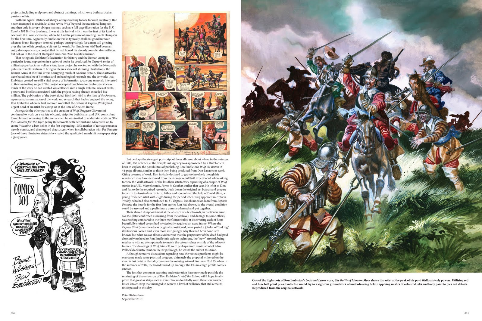
Anyway to get back to Wulf, the book is looking incredible and as I said in a previous posting, I have learned so much along the way, including the story of a "nearly was" reprint of the whole Wulf saga by a Dutch publisher (I'm assuming Oberon) in the early 1980's. But barring a reprint in Marvel UK's Forces in Combat comic in 1980, this book will be the first time that Wulf has been reprinted in it's entirety in it's original format. I'm qualifying my use of terminology as there was an ongoing reprint of Wulf under the title of "Rock L'Invincible" in a French weekly comic with the memorable title of "L'Interpide Hurrah". I kid thee not. What was even weirder was that Ron Embleton's magnificent painted artwork was converted into a monotone grayscale and then a crude variation on the four color process familiar to U.S. comics readers was used to add cyan, magenta and yellow to the pages.

W-eeeeiiiirrrrrrrr-ddddddddddd!!!

Anyway here's some sample spreads from the book, some of which I know are familiar, but if I show you ones you've seen, you can see that I've streamlined the layouts and more importantly I'm not giving away too much.

Here are some more statistics:


The book is going to be printed same size as the original comic, so we're talking approx 36cm tall by 26 cm wide page size.

Two editions:

The regular clocking in at 352 pages, which is a lovely looking thing in red cover with all of Ron Embleton's Wulf strips carefully scanned from optimum copies of the original comics covering his entire output on the strip from May 1957 to September 1960.

All the Wulf 8 page strips from each of the four Express Weekly/TV Express Annuals.

Commentaries on each story.

A foreword by Watchmen artist Dave Gibbons who it transpires was a big fan of Ron Embleton and continues to be fascinated by his work.

A reminiscence by Alan Vince who was fortunate enough to know Ron Embleton as a friend as well as being a fan and among other memories recalls a visit to Express Weekly's art department the week that the famous attack on Cartamandua's fortress artwork was delivered.

An introduction and afterword by yours truly although much of the work involved was due to extensive help and research from Andrew Skilleter, who as an artist as well as friend of Ron's was able to provide an extra degree of insight into his remarkable working methods, Alan Vince who again came through with a lot of information and David Slinn another artist with working knowledge of Express Weekly in the late 1950's to early 1960's - when it comes to writing intros it doesn't get much better than this.

Add in copious amounts of help from comic historians and enthusiasts such as David Ashford, Norman Wright and David Roach who provided me with scans and contacts and you have a much firmer foundation to write about this amazing strip with a degree of crediblity.

In addition to the essays we have samples of original artwork all of which are real stonkers with some vitally important pieces which were not on the collector's circuit coming to us via the assistance of Robert Avery at Express Newspapers, who kindly granted permission for this project to go ahead.

There is also going to be a limited edition of 126 copies of the book signed and numbered which will come in red leather binding with embossed titles and a slipcase.


This book will feature an additional 24 pages devoted to 13 samples of original Wulf artwork - the majority of which have remained unseen by collectors and enthusiasts, which have all been carefully scanned rather than photographed to ensure that the tiniest detail of Ron Embleton's artistry on these pages shines through. The majority of the thirteen artworks occupies a double page spread with a detail on the left side of the spread reproduced at the same size as the original artwork and on the right hand side the complete page. The effect is really stunning and even though this book is going to be expensive it's still going to be less of a stress to the plastic than attempting to buy one, let alone a baker's dozen of these artworks.

I'll keep you informed of the progress of this baby as we get to publication date but here in the interim are those scans.

Saturday 28 August 2010

The Beguiling Artistry of Pauline Martin

Posting a succession of captivating and darkly unsettling illustrations by Alan Lee, set me to thinking about another illustrator whose work seemed to hark back to a bygone era. In the summer of 1973 as a first year illustration student at Brighton Polytechnic, I and the rest of my contemporaries were in a state of excited anticipation as third year students set about organizing their final shows.

A lot hung on these displays as not only was the work displayed to be judged and graded by the teaching staff, but there were external assessors that needed to be impressed as well as industry movers and shakers such as illustrator's agents and designers seeking new talent for their studios to be beguiled. In truth there was much hanging on the outcome of these shows.

All students would be obliged to focus their show on two projects with supplementary course work as back up. The two projects were:

A). The Major Project. Which would probably occupy much of the third year of the course and would be self-initiated as a showcase and summation of all the skills the student had acquired.

B). The Exam Project. Which was a two week response to an external brief under some title such as "hidden" which all the students would need to respond to. The first hint of the "real" world and I can think of at least one friend of mine who made his first publishing deal on the back of his exam project.

So, as I say it was summer 1973 and the first floor studios at Brighton Polytechnic's concrete and glass edifice were abuzz with activity. When the dust settled we were able to view the product of three years intensive study. As usual much of it was very worthy with the majority of work being well presented and competently produced, but as in the case of all such shows out of a total of 30 something students you are talking in terms of three illustrators and three designers who might go on to make full time careers in their respective fields and we as much as any external assessors could see who those chosen few would be.

That year in fact there was a slightly higher than average number of illustrators whose folios seemed destined to grant them access to the promised land with publishing deals, agents and in the case of at least one of the students whose work was not only professional enough to open such doors but also nicely unresolved in terms of where she might eventually be going with it all, the offer of a further three years at the Royal College of Art - on a full grant. Those were indeed different days.

However as far as we were concerned the head and shoulders above all other contenders Star Of The Show, was a student by name of Pauline Martin. Her work was just breathtakingly beautiful and was so haunting that one look was not enough. In truth we found ourselves whenever time would allow, going back to the room where her work was on display pouring over every detail of artwork, the like of which none of us had ever encountered.

The subject that Pauline had devoted herself to was a series of six illustrations for the John Keats poem "Isabella and the Pot of Basil". Six illustrations plus vignettes for the text,  printed at the college which had it's own typesetting department. Whereas six illustrations might seem a little minimal, in truth these were paintings of such arresting detail and design that they burned their way into your subconscious in a way that nothing else in those rooms seemed able to match.

The story of the doomed lovers was a Pre Raphaelite favourite and in mood Pauline Martin's illustrations made even the works by Millais, Holman Hunt and Waterhouse seem feeble in comparison. Her paintings were truly haunting, where shafts of wan light contrasted with areas of lush deep shadow to create an atmosphere of true foreboding. The paintings which were about A4 in size were so compelling that they simply drew you in as you picked out little nuances and semi hidden symbols all pointing to an irretrievably tragic conclusion.

For students of watercolor, her technique was a total contradiction. The way she worked was to place washes of color on clothes and drapes and then "sculpt" them out by wetting her brush and repeatedly lifting of the paint which created a weirdly burnished look to her work. The whole effect was simply hypnotic.


She was already signed up with Jonathan Cape when she left the college and her albeit first small book, was published a few months later as Bamber Gascoigne's novella "Ticker Khan". Another book "Early Rising" followed but it wasn't until 1978 that anything approaching the wonders of her "Isabella and the Pot of Basil" was published.

"Moonlight and Fairyland" re-introduced a collection of folk tales by Lawrence Houseman and although I suspect that the book never went beyond a first printing, it still has some superb moments in terms of the artistry of Pauline Martin. It was to be her last book and what became of Pauline Martin after that and why she never felt inclined to pursue her talent beyond these three books remains something of a mystery.

Tuesday 24 August 2010

A Prequel to Harry Potter???

Long before J.K. Rowling worked her magic on a boy wizard at a boarding school for neophyte spell casters, the artist Steve Lavis was commissioned to do a series of book covers for a speccy wizard kid centered around a couple of books by noted American fantasy author John Bellairs.  Bellairs career had taken off in a new direction, when in 1973 following on from the success of his Tolkien'esque "The Face in the Frost"  the second publisher that he approached with a script for an adult fantasy novel suggested he rewrote it for a younger audience.  The book titled "The House With a Clock in it's Walls" had been followed by another fourteen young adult fantasy novels of which these are two.


They still look amazing some twenty years on:

Monday 23 August 2010

Daan Jippes - Carl Barks Passes on the Baton

I first discovered the fabulous artwork of Daan Jippes some thirty years ago. It was at a time when there was a revival of interest in Carl Barks but not much in the way of U.S. reprint material to satisfy the burgeoning demand for his work.

In contrast the Dutch publishing house of Oberon, who were totally comic savvy in a way that both the U.S. and the U.K. weren't, were offering up reprints of all Barks work, including stuff that had never been reprinted and was not going to appear any time soon in the U.S. of A.

The problem with some of the material was that Western Publishing considered it to be too racially offensive to risk putting out. This was a pity as however visually stereotyped the characters in question appeared, the stories themselves were free from any nasty traits of condescension and included some real gems, such as "Race to the South Seas".

So the only way you could access these stories was to get the comics in Dutch and then sit down with an Anglo/ Dutch dictionary and piece together the stories as best you could.

Challenging but fun.

It was here that I discovered the work of Daan Jippes, as in the case of some of the stories the photostats that Oberon were working from were so dilapidated that Jippes was employed to trace them in Bark's style as well as rectifying some of the more overt racial stereotypes.. Not only that but as many of the stories had appeared as giveaways, or in odd formats Jippes was frequently required to provide new covers for the album and comic reprints.

Jippes whose two great influences are Franquin and Barks, has a truly amazing drawing facility, every character that he draws just pulsates with life and his study of Barks use of line weight and body language was such that he could not only render Ducks in Bark's style but also render them to convincingly match the particular era of Barks drawing.


His genius didn't stop there, he could also match Al Taliaffero's Duck drawings from the weekly Sunday strips and Floyd Gottfredson's Mickey daily and Sunday strips all the way from the early thirties to the late fifties. All simply incredible stuff. The inevitable happened and he was whisked away to Southern California to work at the Disney Studios helping out with storyboards and merchandising.

He's now creating a series of albums in his more Franquin influenced style based on detective stories centered around a shadowy character named Carlier by the late writer Havank.
But here in the meantime are some stunning examples of Daan Jippes Disney artistry.

A lot of these F.A./B. artworks are for sale here:

And another blog worth checking out is here:

All images © The Walt Disney Company 2010.

Sunday 22 August 2010

Wulf the Briton - An Update


Unbelievably the project that started as a result of postings on this blog has now pretty nearly come to fruition. Bar resolving a couple of additional scans for the limited edition, work on "Ron Embleton's Wulf the Briton - The Complete Adventures" is...

complete.

At the start of the exercise, I thought I knew a lot about this amazing strip. At the end of the project I now realize I knew next to nothing, I've since learned a tremendous amount and through the unstinting help of people such as Andrew Skilleter  and Alan Vince who both were close friends of the artist and comics historians Norman Wright and David Ashford and the ever resourceful David Roach, who unbelievably was able to put me in contact with David Slinn, an artist who was working at Express Weekly in the late fifties and early sixties, I have managed to piece together a much more fulsome account of just how this incredible strip was created.

I've also come to appreciate just what an incredibly vital and life enhancing human being Ron Embleton was, everyone I've spoken to who had the privilege of knowing him says the same, he was one of the warmest and most generous people you could ever hope to meet. He was also unbelievably driven, to the point I suspect that he literally worked himself into the ground which was a factor in his sadly all to early death at the relatively young age of 57.


Here are some low res jpegs of some of the scans that went into the production of this book which is going to be a hefty read at 352 pages. We're very privileged to have been able to secure the services of fellow Embleton fanatic, Dave Gibbons to write a foreword to this epic book.

Saturday 21 August 2010

BBC Radio 4 News - Anaesthesia For The Middle Classes

It's been one of those weeks, when I have suffered several of those "Gran Torino" moments. "Gran Torino" is a film all about the inner rage of old gitdom. The old git in question being Mr. Clint Eastwood, who has grown so weary of fulminating against the stupidity of the world that he just utters the occasional, "Urrrrrrrrrrrrrrrrrrrrrrrrrrrrrr" followed by an even more resonant, "Rrrrrrrrrrrrrrrrrrrrrrrrrrrrrrrr". When Clint comes up with these sound effects you know some bad juju is going down.

The cause of my particular attack of acute bad juju was incautiously listening to  Radio 4 News coverage. I'm very, very sparing of exposing my precious brain cells to much input from the spawn of yet another old git, Mr. John Reith. Reith as you may well be aware was the man who founded the BBC in 1922, with the "Reithian" remit to, "inform, educate and entertain". The bulk of the BBC's efforts these days is to attempt to fulfil the third part of this brief as well as provide employment for the tier upon tier of middle management that one of Reith's successors John Birt foisted on the corporation when he attained Director Generalship of the Beeb in 1992.

However there are still little redoubts of the BBC where there is evidently some vestige of the Reithian remit as originally envisioned by it's cantankerous and contradictory founder. Radio 4 is for many of the middle classes in the UK, still the favored source of information. Programmes such as "Today", "The World at One" and "PM" are for many listeners, their first port of call for news and comment on what's happening. These programmes are however deeply flawed, insofar as the presenters and journalists working for them seem at times wholly incapable of thinking outside the box and instead seem to find more fulfillment in endless analysis of the political minutiae of Westminster than what is actually going on in the "real world".

There are endless examples of this, too tedious to recount, but put it this way, if you are worried about the implications of "rocking the boat" as a Radio 4 journalist, you are not going to attempt to dig under the skin of really interesting news in the making. For years and years, Evan Davis was THE guide to the world of banking and the city, he was Newsnight's economics correspondent all the way through the lead up to the banking melt down...

... and guess what???

He never to my knowledge, seemed to wise up to what was happening, even though he's no intellectual slouch and weird things such as house prices were spiraling out of control, fueled by unprecedented relaxation in bank's lending criteria, not once did he attempt to examine the methods by which banks were facilitating their profligate lending in what in retrospect was one of the biggest stories in recorded history.

When Robert Peston actually dared to contradict the reassuring noises emanating from Evan Davis vis a vis the iminent collapse of Northern Rock and the fact that as Davis put it" shares go up and shares go down, but there's no need to worry in the long term", the little old ladies from Golders Green were the first to start queing outside the branches of the Rock. Peston as a result of the plaudits lavished on him beyond the portals of Broadcasting House, became the ipso facto face of BBC reporting on the City and Davis went on to present the "Today" programme and TV's "Dragon's Den".

This week's display of thinking well within the confines of the box came as a succession of BBC programmes covered this years record A level results. There were one or two mentions of grade inflation but no one seemed willing to discuss the criteria by which exam boards set their grades. Put very simply and without wishing to pour too much cold water on the achievements of our kids, exam boards are like any other venture trying to attract customers - EXTREMELY competitive. When it comes to setting the level at which pass mark percentages hit that highly sought after grade A benchmark, they use a graph to determine the apex of the bell curve created by each paper's results and there they fix their grade A. Not exactly fair as one year's percentages might be well down on the previous year's but you'd never know from the headlines.

As far as BBC coverage is concerned its the question that dare not make it's presence known.

From there the next news item attendant on the previous item and waiting decorously in the wings, was the shortage of university places to accommodate all the self evidently high scoring A Level students. Now here you would think that some kind of acknowledgment that it's all getting a bit expensive, without any guarantee of a graduate status job at the end of the exercise - in fact any job full stop, would have entered the coverage. When a representative of the Sutton Trust (an organization dedicated to providing educational opportunities for underprivileged  youth) was asked whether or not he felt that young people's expectation levels were being raised to unrealistic levels, I did think that perhaps there was going to be some criticism of the way that students are encouraged to go off to university as a given to study their least worst subject, only to be badly let down at the end of the exercise when they discover their degree is worse than useless. But no the interviewer was again referring to the shortage of university places, not the jobs that these universities are supposed to be equipping students to attain.

There was I'll admit some slight acknowledgment of "recent difficulties" but once more the old Government statistic that on average University graduates earn £100K more over a life time than non-graduates was dutifully trotted out. Again and for the umpteenth time no attempt made to expose these statistics to any kind of scrutiny, although how anybody with any kind of functioning brain would be remotely swayed by a Government statistic is beyond me.

Bit insane really as the news that didn't get covered is the now growing number of A-Level graduates who are saying no to debt of £25K and rising plus the possibility of a "graduate tax". What the Fck is that all about? - please someone at the BBC why don't you get your teeth into that instead of what was in the LibDem Manifesto last year? Anyway these young people, often it has to be said highly driven and self motivated, are going into employment with training included and we're not just talking about jobs at McDonalds, there are accountancy firms, law firms and even City institutions who are recruiting A-Level students now.

Did I hear mention of this on Radio 4? Well if it happened I missed it, all I got to hear was how if you're middle class with pushy parents you'd probably been on the phone to UCAS already, the hint being if you're from an underprivileged background you shouldn't let these toffs beat you into NEET'dom (Not in  Education, Employment or Training) you should really get on the phone now. If you can't get onto the course you originally applied for try another course or another uni. Join the rush of the lemmings to the sea.

Rrrrrrrrrrrrrrrrrrrrrrrrrrrrrrrrrrrrrrrrrrrrrrr!!!!!!!!!!!!!!!!!!!!!!!

and:

Urrrrrrrrrrrrrrrrrrrrrrrrrrrrrrrrrrrrrrrrrrrrrrrrrr!!!!!!!!!!!!!!!!!!

I'd like to think that the bright kids from less privileged backgrounds were doing the smart thing and exploring ways to make a living while adding to their skills base without saddling themselves with 25k and rising debt, that's the way talk is turning at the moment but unlike BBC presenters who are relatively inured from the vicissitudes of having to earn a crust in the private sector, the people I hang out with are dealing with the here and now and consequently are just as pissed off as old Clint.

Illustrations from the Golden Age of The Radio Times by Stanley Herbert and E. McKnight Kauffer (Christmas Issues)

Further food for thought:

Friday 6 August 2010

Wulf The Briton - A Book in the Making

As I hinted somewhat obliquely a couple or so weeks ago, there is a very exciting publishing project which I'm currently engaged in with the good people at BookPalace Books. To cut to the chase as a result of my weekly blog postings earlier in the year I had an approach from Geoff West CEO of Book Palace Books to enquire whether I would be interested in editing a collection of all Ron Embleton's Wulf the Briton stories. As this was the comic above all others that totally captured my imagination as a child and as no one has ever attempted to do this before, I jumped at the chance.

The intervening months have been a whirlwind of Wulf activity, involving meetings with the people at Express Newspapers, talking to people who were close to Ron, seeking out material which would help shed light on the creation of this epic strip and uncovering hitherto unseen by all but a few, original Wulf boards.


And then there's been the scanning and careful and lightly applied restoration of the comic page we're sourcing this epic story from. It sounds like a gargantuan project and it really is a gargantuan project. We're talking 300 plus pages of Wulf the Briton, plus all the annuals, plus any other piece of Wulf artwork generated by Ron - epic!

The book will come in two different editions, a regular edition and a very limited (100 copies leather bound and slip cased edition). The slipcased edition will feature some absolutely stonking pages shot from the original artwork, much of it only recently unearthed and not having done the rounds of the collector' s circuit and in absolutely pristine condition. The pages will be printed at the same size the comic was published so there has been very careful work done to ensure that there is no loss of Embleton's brushwork, we want owning this book to be as pleasurable as having an entire run of  the original comics but with the added convenience of being all bound together in a durable format.


All in all something to get very excited about if you're in any way a fan of Ron Embleton's artwork and much of this work represents him at the top of his game. A word of warning though and that is the book is going to be expensive as even the regular edition is going to be limited to 400 copies.

But everyone concerned is working long hours to ensure that we get this right, down to paper type and weight in relation to the scans that we supply to the printers - no effort is being spared to ensure that this book is something that everyone involved with can feel proud of putting into the hands of you the reader.

So here as an appetizer are some scans of the work in progress. We'll keep you posted on the book's progress, but we're getting there much quicker than I had originally anticipated.