Today we're taking a small commercial break, aka a message from our sponsors, as we briefly reconnect with the catalyst for this blog as well as title originator, Cloud 109.


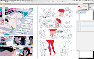
A fortnight ago we showed you the initial process of laying out a page of Cloud 109, it's part of a sequence where Gina, Cary and Rabby in their avatar incarnations revisit the strangely deserted cyber lounge of Cloud 109 as they try to locate the source of the virus that is spreading throughout the virtual world which is rapidly in danger of becoming their first rather than second home.
By this stage of the process everything is literally mapped out, the beauty of Illustrator is that every shape you create continues to be "live" and manipulable, each object being an entity in it's own right, which as mentioned earlier makes it breathtakingly easy to adjust and import elements without the conflicts of scale and resolution attendant on such manoeuvres in Photoshop.

The reason for this critical difference is that Illustrator is a vector based drawing tool and as such creates beautiful and elegant clean lines, which no matter how much you enlarge them stay beautiful and clean. Whereas Photoshop is a bitmap based software and on closer inspection is created from loads and loads of little pixels, the higher the resolution you set the greater the number of pixels but they are always, always there.

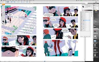
So here we are with the new page all mapped out, lettering in place and colors ready to be applied. Each shape when selected is colored by placing the dropper tool over a swatch or creating a new color in the color toolbox using an adjustable slider. But here's the fiendishly clever thing about Illustrator, you can use already established colors from your completed pages to create sets of swatches for the page you're working on, or in this case literally select and drag one of your completed pages onto the image your working on and then it's just a matter of using the top left hand black arrow selection tool from the toolbox on left of the screen to select say Gina's beret and then taking your dropper tool and touching the already colored beret on the left hand image and voila - instant color.
Couldn't be easier!
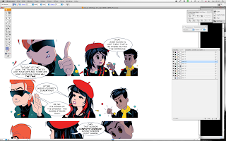
Each upgrade of Illustrator gets progressively more flexible (CS5 looks the best yet!) and layers can now achieve the same kind of tricks as Photoshop layers, so the shadows which suffuse all the scenes in Cloud 109 are drawn in a layer where the opacity is set to Multiply rather than normal and the opacity is set at 50%. Now you have nicely moody shadows which are a vital part of your storytelling and as they're all easily adjustable you can feel free to experiment.
Back lighting effects are added to a layer on top of the shadow layer as in the blue light that is illuminating the underside of Cary's face in the top layer. As you fill in the colors any adjustments that are required are easy to achieve, by the time we get to the last image you can in fact see that it's pretty nearly done and I'm off the the next image again using it's predecessor as a guide and color palette while the new pencil drawing is being being once again worked up in Illustrator.
Only another 27 pages to go on book 1.
Earlier installments of this epic adventure are situated
here and
here.
 Total self indulgence, but I hope you like them too - more of Ken Barr's in-your-face artwork for DC Thomson's Commando comics from 1962.


