
 The assignment which was now tucked into Krigstein's folio was eight pages of pencils by Al Williamson, who was running late on a science fiction story for what would be the last issue of Weird Science before it merged with it's sister publication Weird Fantasy. Asking Krigstein who's line work was gritty and contemporary to ink Al Williamson, whose work was suffused with a lush and overtly retro feel was obviously more motivated by Gaine's concern over a possible missed deadline than it was any aesthetic consideration.
The result was as near a disaster as one can get in terms of unsympathetic inking and when Williamson saw the partially completed pages he was appalled and swiftly summoned up the forces of Frank Frazetta and Roy Krenkel to attempt to salvage the mess. The result was one of the most elegant Al Williamson jobs ever to appear in the EC sci-fi comics.

 But despite this less than promising start Krigstein started receiving scripts from Feldstein and as he worked on them so his enthusiasm for the material he was working on grew until he was pleading with Feldstein for more pages to do justice to their full potential. Feldstein ever the pragmatist said no to the increase in page allocation, motivated not just by budgetary constraints but also by the format that he had established for the comics many years earlier, i.e. lead story 8 pages, second story 7 pages, third story 6 pages and final story 7 pages. He did however suggest that Krigstein could create more panels and they would letter up the pages accordingly. Krigstein slightly balked as it meant drawing more content for the same page rate but it was either that or nothing so Krigstein started cutting up panels to create more opportunities for his storytelling to flourish.
 Krigstein wouldn't give up on his requests for more pages and it was a story slated for an issue of Crime Suspenstories (issue 26 to go with the cover that Kamen had already drawn) that was to push Krigstein to completely usurp his role as mere artist for hire and challenge Feldstein's editorial authority by adding an extra two pages to "Master Race" and create a long term comics masterpiece about man's inhumanity to man but a short term headache for Feldstein who now had a story that wouldn't fit the comic it was originally commissioned for.
"Master Race" has now become a comics legend, reprinted and re-examined so many times that it would be tedious to add anything further to the discussion. What however remains of Krigstein's EC output is a raft of stories where the artist was constantly experimenting , cutting up panels, running dialogue in the text boxes rather than their own balloons as in "The Catacombs", adding cinematic touches such as lens flare and motion blur and constantly pushing the boundaries of a medium which is cursed by cliche.
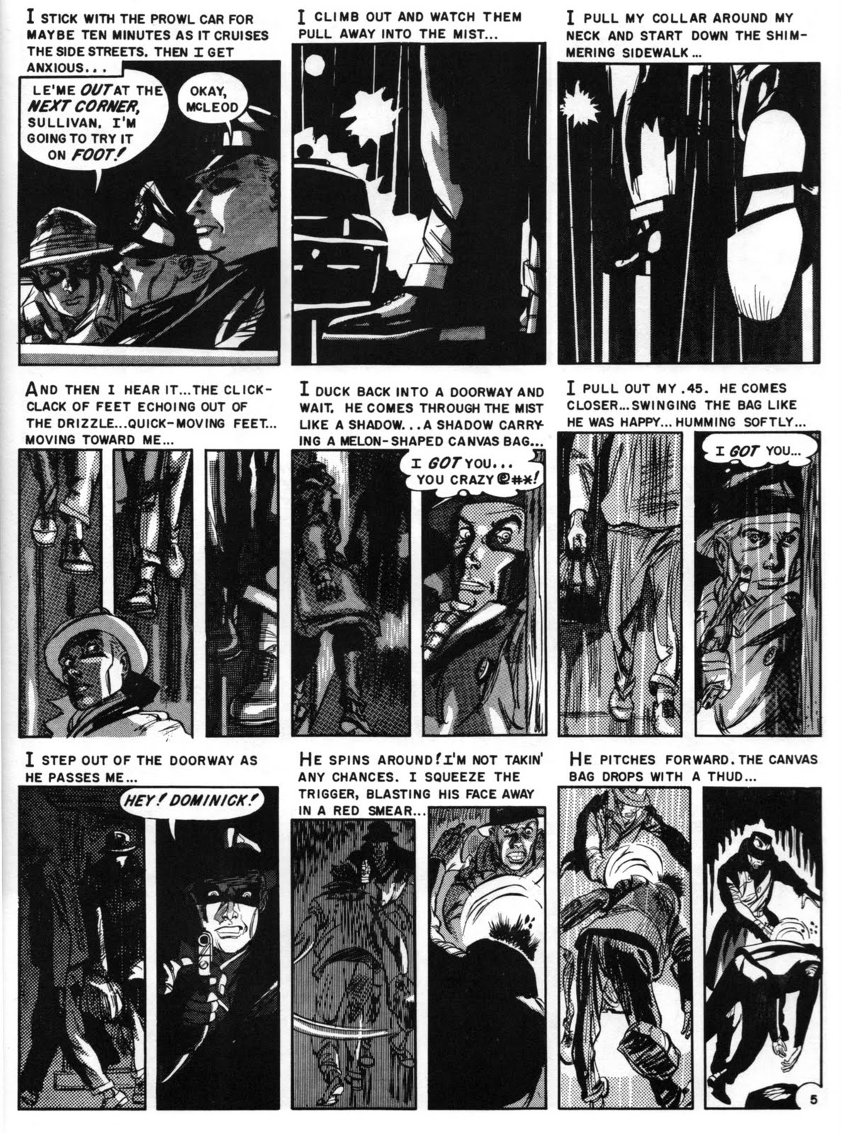

Here is an example of such a story, scripted by Carl Wessler for the last issue of Shock Suspenstories, "In The Bag" represents the peak of Krigstein's creative hiatus with EC after this it was a gentle drift downhill, with Feldstein's intransigence over page allocation and a drop in page rate from $41.00 to $35.00 and the ongoing delay in the publication of "Master Race" undermining Krigstein's passion for an art form that at the time he regarded as on a par with painting.


Krigstein was another storyteller that like Will Eisner,Johnny Craig,and Harvey Kurtzman,could actually tell a story in one or very few pages.He really didn't cram everything together,it just went into a perfectly nice order,which would do any editor proud.Frank Miller and Jim Steranko were fans,their work developed even more into a cinematic approach because of Krigstein's innovations.Liam
ReplyDeleteI grew up with Frank Bellamy's astonishingly dynamic page layouts on strips like Heros the Spartan and Thunderbirds, where a two page spread would be dramatically fragmented into panels of all sizes and shapes. Jagged borders would reflect the images they contained by taking on the stylized form of flames, lightning or explosions, while key frames were highlighted so that the eye was immediately drawn to them. Yet however sophisticated his breakdowns became Bellamy always made sure that everything was organized into a single polyptich composition in which each individual element made a vital contribution to the overall effect.
ReplyDeleteHaving said that I can't help but feel that in making such dynamic panels the norm rather than the exception, many current American comics have ended up with pages that simply confuse the eye to no real purpose. To my mind the standard nine-panel page used by EC gave their stories a valuable rhythm that was comparable to the metre and rhyme structure of a poem. The marvelous thing about Krigstein's layouts was the fact that, like a poet, he constantly subverted this structure from within - slicing and dicing his panels to vary the pace and emphasis while the overall grid still remained visible.
I agree with Liam that he was years ahead of his time in this, and that it was only with the arrival of artists like Miller and Steranko (particularly in his ground-breaking 'Chandler' graphic novel) that the rest of the medium began to catch up.
Unfortunately, it seems to me that lesser talents have since gone on to 'throw the baby out with the bathwater' altogether by getting rid of any structure at all. In effect they have produced a chaotic style that could only be enjoyed by readers with extreme attention deficit disorder...!
Give me a grid every time Phil, it just adds to the cinematic feel of Krigstein's storyelling.
ReplyDeleteAnd that's the raison d'etre that makes great comics truly timeless, storytelling has to be king.
Phil, I totally agree with you. Non-standard panel shapes and layouts are like tricksy camera positions and moves in a film. I have a couple of Chris Bachalo's Steampunk graphic novels, and between chaotic panel layouts and multi-font lettering, I can't make head nor tail of the story.
ReplyDeleteSidney Lumet, talking about his courtroom movie The Verdict, said that he needed to start off with very straitforward compositions and static camera, "otherwise I'd have nowhere to go at the really dramatic moments". A good lesson for today's comics creators I think.
Leo and I always figure that you have to have a good story reason for getting creative with panel shapes - eg, we did it during a train crash, there the panels are all tilted crazily and jumbled in together. Most of the time, what's in the panel should grab more attention than the panel itself. Although I did love those Bellamy Thunderbirds strips as a child.
Btw there's a very interesting bit in Making Comics where Scott McCloud illustrates the trade-off between clarity and intensity by showing one story sequence illustrated in several different ways.
The way in which Krigstein used zip-a-tone is very interesting. He seems to use it as a drawing tool rather than just to add a gray value to one area. I'm not sure if anyone else has done this much with it.
ReplyDeleteAs a matter of interest have you been getting the recent Century 21 collections from Reynolds & Hearn Dave? I've just received Volume Four from those nice people at Amazon and it's particularly noticeable that the Bellamy pages (most of which were shot from original artwork) have a tendency to dramatize each panel as though there's a train wreck taking place in every single one - even if it only shows a talking head!
ReplyDeleteI remember being absolutely blown away by these spreads when they originally came out, but I must admit that the main attraction was always the immediate 'Wow!' factor rather than any particular desire to read the words. In this respect I think that Bellamy was accurately recreating the appeal of the Thunderbirds TV series where explosions and spectacle were always emphasized at the expense of old-fashioned storytelling and character development.
By contrast I find the Fireball XL5 and Zero X strips rather more involving as stories, precisely because Mike Noble's artwork is so much less extravagant - though Bellamy is clearly the better artist.
I always thought of Bernard Krigstein as a lost visionary of decompression before the term was used, or even expanded on. As another reviewer said, it's a shame that he never got the chance to publish a feature-length story that could've shown his talent rather than have to cram artwork under piles of text that would distract the reader. If he'd had more say, we could be seeing more American styles of Manga-style pacing that would be pleasing to the eye.
ReplyDelete