
 Not the first choice for today's posting, not the second choice either but the more I looked at Matias Alonso's color album covers on yesterday's blog, the more I thought about the early years of Dick Sprang's long and glorious tenure on Batman. There are definite similarities and a definite homage to Burne Hogarth, with an almost frenetic and mannered dynamism to the artwork with strong use of deep solid blacks and detailed penmanship adding to the swirl of brush lines and edgy over the topness.
 Whereas in the case of the other pre-eminent Batman artist of the 1940's Jerry Robinson there is a loose and predominantly painterly feel to the brush work emanating from the influence of Noel Sickles, with Sprang as with Alonso the similarities to Hogarth are very evident.
By the time Sprang secured his Batman gig, even though he was just in his mid twenties, he'd been working in the field for about ten years and had a lot of drawing to deadline experience under his belt. Everything from drawing furniture for catalogues to drawing pulp illustrations for Street and Smith. When Batman editor Whitney Ellsworth saw Sprang's samples he immediately started giving him as many Batman scripts to work on as possible. The year was 1941 and Ellsworth was mindful of the fact that his golden boy Bob Kane might be called up at any moment. Whatever else happened there mustn't be any cessation of the assembly line production of Batman stories and so Ellsworth set about building up an inventory of Sprang artworked Batman scripts.
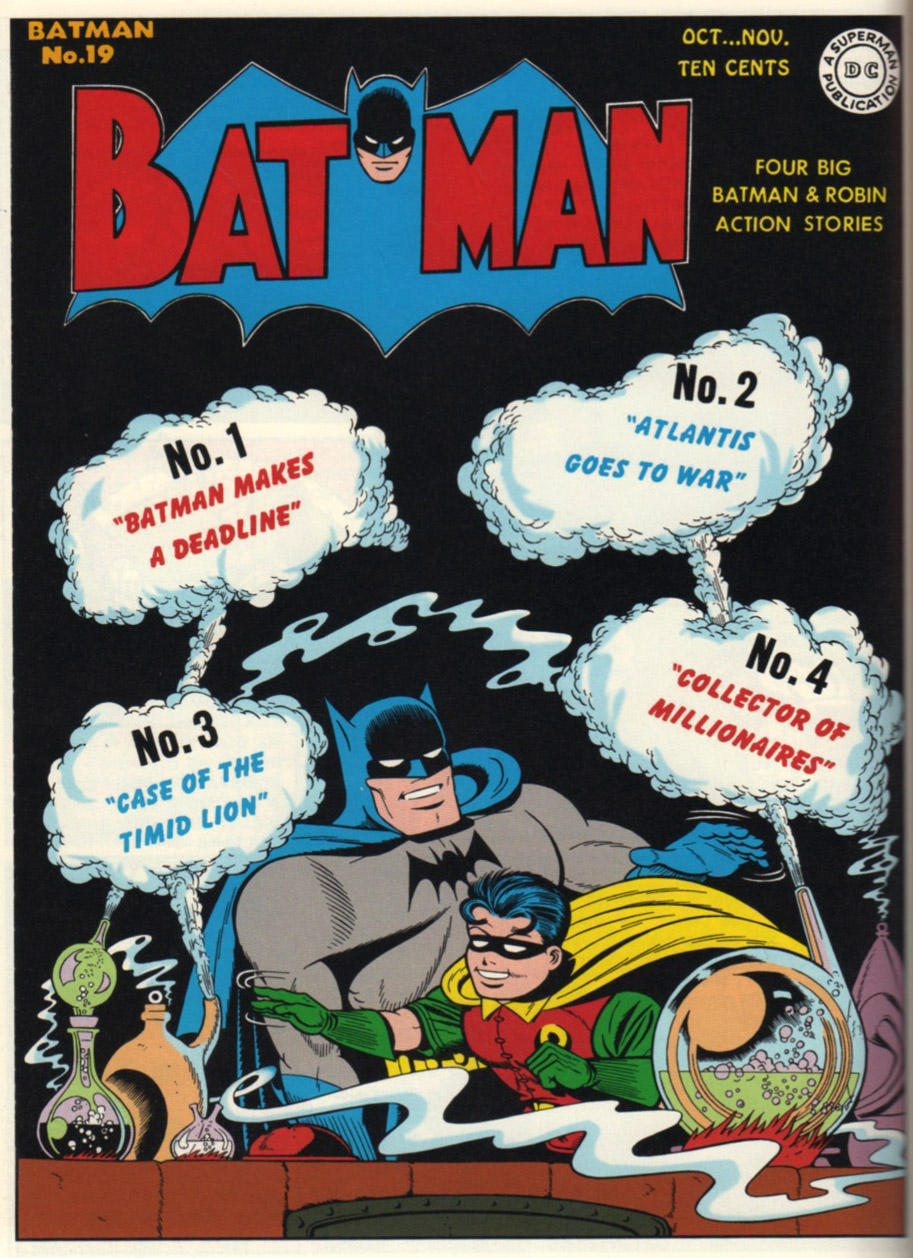


 By the time the first of these appeared in 1943, Sprang had created so many stories that entire issues could be published containing four stories of Sprang artwork and for style anoraks it's fascinating to see which ones were the earliest ones, which ones had assists from Sprang's then studio amigos, Norman Fallon and Ed Kressey and which ones were lettered by Sprang and which by his wife. Sprang although not averse to plundering the occasional Jerry Robinson pose was stylistically and anatomically at complete variance to Robinson, whereas Robinson's Batman did appear anatomically correct, Sprang threw Bridgman and naturalism out the window and dispensed with a waistline altogether, in Sprang's Batman the chest erupts from the utility belt, figures don't run, they leap and everything seems to inhabit a high octane adrenalin charged world.


You can see why Alonso got me thinking about Sprang...
The reproductions are all taken from the DC Archives series, the latest of which Dark Knight Archives Volume 6 is just stunning in terms of repro. Pity some of the earlier ones are so iffy, it would be nice to see all the stories presented with this much care and fidelity to the original line and color work.
All images © DC Comics 2010


We're publishing a book on Jerry Robinson this month. I hope you'll check it out and if you're going to be at New York Comic Con look for Jerry himself who will be doing signings and panels. http://www.abramsbooks.com/Books/Jerry_Robinson-9780810977648.html
ReplyDeleteWow!
ReplyDeleteAmazing news, pity as I'll miss the New York signing by a month, but I'll definitely be arming myself with a copy of this treasure and I'll look forward to reviewing shortly therafter.
That is if you guys are cool with that.
P.S. I thought your "The Art of Harvey Kurtzman" was one of the best "Art of..." books I've ever come across. Brilliant job by all concerned.
This comment has been removed by the author.
ReplyDeleteBack in the late 1960s when Neal Adams and Denny O'Neil were introducing their vision of a grim and gritty 'creature of the night' I completely bought into the myth that supposedly 'unrealistic' artists such as Dick Sprang had turned Batman into something of a laughing stock by the beginning of the decade, and that the character had only avoided cancellation by the skin of his teeth as a result of changes that began with Carmine Infantino's 'New Look'.
ReplyDeleteNow that most American comicbooks seem to have taken the notion of 'realism' to quite absurd levels, whereby death, rape and crippling injury are almost everyday events, I look back on Sprang's wonderfully stylized artwork as a kind of lost idyll from a more innocent age. In retrospect it's easy to see that he belonged firmly to the hard-boiled, tongue-in-cheek tradition of Chester Gould's Dick Tracy, and that the right-angled jaws and cartoon villains revealed a truly sophisticated sense of style rather than any lack of drawing skill.
It's good to know that he survived long enough to be recognized as a true master in the final years of his life, finding time to produce some outstanding new work - including a fantastic poster of the Batcave.
Yes! I'd rather foolishly overlooked the Chester Gould legacy Phil and in fact one of the ghostlier of Kane's ghost artists Lew Sayre Schwartz really did exhibit quite a lot of Gould traits in his Batman stories from the late '40's through to '50's.
ReplyDeleteI remember seeing his "Origin of the Batman" from Batman 47, thinking that it was Bob Kane on a really good day and it wasn't until years later that I realized it was Schwartz.