Wednesday, 31 August 2011

Achtung Commando - (And A Brief History of Repro for Commercial Printing)

Behold there is a new batch of Commandos due to go on sale tomorrow and for your dear old blogmeister a moment of true nostalgia as the latest of the first twelve issues gets it's third revival.

When in July 1961, I saw the distinctive Ken Barr cover in my weekly Victor Comic I just couldn't believe a comic could look that good. It was the drama of the scene and the British paratrooper falling into the cliff side nest of Nazi gunners with their helmets all aglow with the last rays of the setting sun in the beautifully executed reflections that added so much extra punch to Barr''s work.

When this now historic comic appeared fifty years ago it looked great, it was an example of the wonders of commercial printing. In those days the artist would send in their artwork usually on board and it would be photographed and the transparencies would be the source of the plates used to print his artwork using four runs (sometimes more) which would print a sequence of dots in 1). Cyan 2). Magenta 3). Yellow and 4). Black. By the time Commando number four was printed the whole process was pretty refined and misalignments creating out of register prints were the exception rather than the rule.

Here you can see the results:

Now then let's spin the hands of the clock forward three decades or so and as the pages from the calendar whip past our heads we are in 1992 and here is the same issue again reprinted and as DC Thomson (canny Scots that they are - "och aye wuirrrrrrr nay fools ye ken") have hung onto their original Barr artwork they can now present you with an even sharper example of the painting via digital scanning, which in 1992 means DRUM scanning.

Now drum scanning is good - very good in fact for catching every little nuance that a camera in 1961 would have hinted at rather than reproduced in minute detail.

But ... there is a price to be paid. To get the artwork scanned you have to ever so, ever so, evvverrrr so carefully pull the artwork off it's backing board. In the 1980's illustrators could buy artboard specifically for this purpose - it was called stripper board and you would pull up the corner and then gently roll the corner away from you using a cardboard tube to wrap the thing around. This is what seems to have happened with Barr's painting, only the board he created the picture on was not being as co-operative as the person tasked to perform this operation might have hoped and it looks like the operative placed with this delicate task might had substituted an object of much smaller radius to anchor the paper on as he rolled it off it's board.

Something like a biro perhaps???...

You can almost sense the rivulets of sweat coursing down the operative's brow as Ken Barr's 30 year old gouache started to flake away from the surface leaving this cover as mute testimony to  the travails of studio bodging:

Now then we spin the clock hands forward another twenty years and here is the same cover again, in even sharper detail courtesy of further advances in the art of digital scanning and looky looky!

Yup by the hands of some studio whizz kid tiddling around in Photoshop we have a minor restorative miracle.

Not sure about the Green on the Denison smock though...

I'll post more about these comics tomorrow, I've had an email from my dear old mate Malcolm who has gently nudged me in the direction of reducing the gap the blog postings have been prone to.

There are a variety of excuses I can offer you guys, but one of them when it is made a bit more public will I am sure gain your approval.

All images © DC Thomson 2011.

Tuesday, 23 August 2011

James McConnell - The UK's Very Own Pulp Artist.

There are some artists where love of their subject matter is accompanied by an equally passionate love of it's iconography.

Such an artist was the Northumberland born James McConnell. Born in 1903 he was a near contemporary of such US artists as Norman Saunders and Hugh Ward and like both those artists he seemed most at home with rugged and doughty heroes in equally rugged landscape, where a man had only his wits, his hoss and his sixguns to keep himself alive.

McConnell who spent much of his early manhood working for a block maker, studied part time at London's St Martin's School of Art until at the age of thirty he was finally able to realize his ambition of becoming a full time commercial artist. Like his US contemporaries Saunders and Ward he would have found a perfect home with the publishers of pulp magazines, but although such outlets were not really viable (or even existent) in 1930's Britain, the burgeoning paperback market was soon to provide regular employment.

Here then are some samples from those early years of McConnell's career before a certain Fleet Street editor by name of Leonard Matthews spied his work and inundated him with as much work as he could handle for a new project which was to eventually become the famed children's weekly Look and Learn.


Tuesday, 16 August 2011

Louis Raemaekers - The Power to Shock

It's easy in this age of mass communications and on the spot film crews to overlook just how important illustration was as a means of imparting news of unfolding events at the start of the previous century. In the case of the Dutch artist Louis Raemaekers, his depiction of German military aggression during the First World War was so powerful and so brutal that when the Dutch government was presented with a de facto cease and desist order from Germany, Raemaekers and his family eventually had to settle in London. Dutch neutrality being no guarantee of his safety.

When one compares Raemaekers work with that of the Second World War cartoonist David Low, some twenty years later, one is immediately struck by the sheer savagery of Raemaker's art. Low in comparison seems quite benign.

To get anywhere near a Second World War equivalent of the visceral rage of Raemaekers' work one would need to look at the drawings made by Soviet cartoonists. The equivalence being that in both cases the artists had first hand experience of the horrors of war.

For more information on Louis Raemaekers check out the excellent biography of this great artist on John Adcock's essential Yesterday's Papers blog and once you've soaked up all the information, journey on through the electronic mists of cyberspace to the wonderful ASIFA Animation Blog where more of these incredible drawings are displayed.


Saturday, 6 August 2011

Growing Old Disgracefully and One of the Coolest Bands Ever!!!

As readers of this blog are aware, from time to time I deviate from the world of comics and illustration
and venture into the potentially contentious zone of music. Each time I do I am aware that there is no greater divider of cultural morays than the world of rock and roll. I can well remember the week at Brighton Art College, when towards the end of an altogether very harmonious first year, someone thought with summer looming and final assessments for the year over, it would be really very chilled to have some music.


Enter - The Dansette Record Player.

Enter - Disc(h)ord.

Within a day the studio was polarised. Girls with platform soles (it was the early 1970's folks) tottered over to the infernal machine to pile up a stack of 45s  as in revolutions per minute - but not much of a revolution if all you end up with is Gilbert O'Sullivan or David Essex. Over in my corner the Northern contingent would shake their greasy tresses and call for "sum Sabbath" and "there's nowt like a blast of Hawkwind", whilst my mate Dave espying a Beach Boys album tucked under the bri-nylon wing of one the graphic designers, declared that there was no effing way he was going to tolerate listening to a bunch of namby pamby surfers.

So I try not to venture too  many opinions on rock - just occasionally as in from time to time.


Part of the problem is that I come from a generation that believes it's music was the best, partly this is a generational phenomena as in everybody believes that theirs was the best music and partly because the art form itself has stuck in a kind of time warp groove for the last fifty plus years. Big bands as in the Glenn Miller era were almost a blink of the eye in comparison.

So people of my generation cleave to their comfort blankets and if you want a reminder of how strong this urge is just look at magazines like Mojo when next you step into your newsagent.

In my opinion this is sadsville. I did have a subscription to Mojo magazine which I ran for several years until I got so bored with their dumbed down crop rotation system of:


Dylan, The Beatles, The Stones, Clapton, Queen, The Clash, Dylan, The Beatles, Zeppelin, that in a fit of hubris I sent the editor a letter to warn him if they didn't mend their ways and talk about happening music I would terminate my subscription. Something along the lines of "if I am in my fifties I don't need the constant reminders thank you". Needless to say no response, so I cancelled the subscription in a mood of self righteous ire. Mercifully before the next issue with a check list of 10 little known facts about Elvis Presley hit the streets.

Pity the poor journos who have to dish up this drivel, I could walk away they can't.

Not that I'm entirely down on old farts making a ruckus. As an example of the wonders of third age rock n' roll check out these madmen - aka The Special Branch, doing a cover of the immortal Dr Feelgood classic, "Going Back Home":


Wonderfully anarchic moment with the Tijuana Tin Sandwich!


But for the most part as with all artistic endeavors I like to face forward, so bands I'm listening to at the moment include this outfit:

Absolutely addictive stuff if your into psych drenched, feedback suffused, mesmeric music:


Another band that falls outside of the mainstream radar and ought to be checked out if they ever play a gig near you.

And in the meantime check out The Crocodiles MySpace for more of this exquisite stuff.

Tuesday, 26 July 2011

Sci-Fi Meets World War 2

Ron Turner is rightly regarded as one of the leading illustrators of post war UK science fiction but by the early 1960's work his workload was beginning to ease up just a little bit. Not to the extent that he was going to have to put away his paints and brushes and get a proper job, but perhaps expanding his client base beyond science fiction covers for Scion and Rick Random strips would at least reduce his exposure to that most dread of illustrative phenomena the quite fortnight or even (horror of horrors) the quiet month.

So ever the pragmatist, Turner's work started appearing on the covers of Practical Mechanics and even the outlined and number keyed artworks that were sold as a means of assuaging people's frustrated creativity were soon to feature Turner's artistry. Yup! Astonishing as it may seem Ron Turner contributed designs for Craft Master's Painting by Numbers kits.

Some of them at least were science fiction subjects.

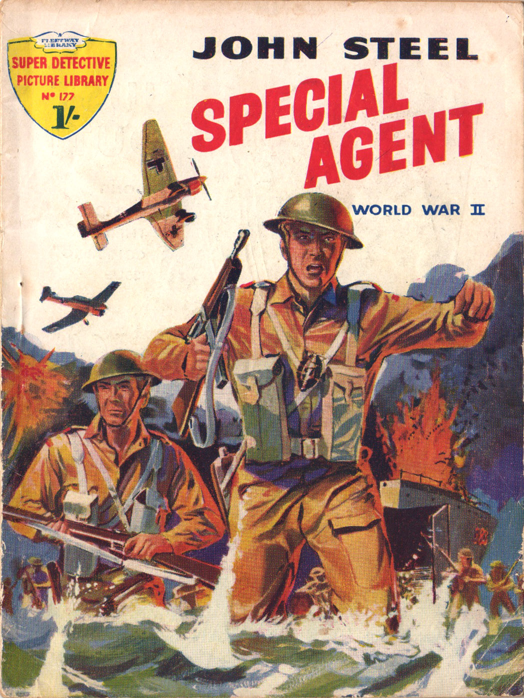
He also contributed a really different take on the classic war pocket library when he provided the interior artwork for issue 177 of Fleetway's Super Detective Library.

Lovely work indeed!

Cover by Nino Caroselli - the rest by Ron Turner.

Images © IPC Media 2011.


Monday, 18 July 2011

More News From Commando HQ and a Teaser From Mr Flake

As in Mr. Flake your sometime blogmeister. The good news is that the mad surfeit of work is coming to an end and I can devote more time to this much neglected blog. But and here's the even better news, I am working on a project which takes the very generous observation of Mirabilis author Dave Morris, about wishing that some of the subjects that we have covered on this blog over the last two years could be published then wouldn't that be cool or words to that effect.

Well I have an even better thought and that is that wouldn't it be great if several of this countries most energetic ephemera enthusiasts got together to commit their researches to print rather than blogoshere then wouldn't that be even cooler?

Well just such a project is in the works and more will be revealed shortly.

In the meantime, here is a double biller of current and imminent Commando's from Calum Laird and the boys at Commando HQ.


Commando 4407 – They Came By Night

BEACON OF DOOM

Without warning the periscope of a U-boat broke the surface. It turned and focussed on the Locksea Lighthouse. Then, slowly, the glistening, black hull of the submarine came up from the depths.
   No one could deny the courage and cool cheek of the Nazi Commander who had made up his mind to capture this vital link in the guiding of our Atlantic convoys.
   Then, into what was to be the most fantastic episodes of the war, sailed Skipper Jimmy Cleeves and his RAF rescue launch K20.

Introduction by Calum Laird, Commando Editor

Nowadays Commando writers have it tough. In our 50 years, loads of plots have been used, and they have to try really hard to find a new angle on things. Back in 1961, though, when Commando first broke cover, the writers had a very open field to work with.
   So you might think that this sixth story to come out would be very straightforward. If you did, you’d be wrong. It has ships, subs, bombers, recce planes, a lighthouse…and even a carrier pigeon.
   Even when they’ve got it easy, Commando authors just can’t help writing cracking stores.

They Came By Night, originally Commando No 6 (August 1961), re-issued as No 2563 (April 1992)

Story: Couglin
Art: Savi
Cover: Ken Barr


Commando 4408  The Cop Who Went To War

Dave Marley was a policeman ⎯ and proud of it. When the war came, he joined the Military Police and found that a lot of soldiers acted just like the blokes in civvy street who didn’t want to know a copper until they had trouble.
   But now there was more than brawls and bank robbers to think about. There were difficult problems to be tackled with the added danger of shells and bullets crashing all around. Yes, it was a tough job, being a Military policeman…

Introduction by George Low, former Commando Editor

The Military Police do a difficult and dangerous job, and it’s not always appreciated by the common soldier, sailor or airman. In the rough and tumble of war, men fresh from action often don’t take it well when a Redcap gets on their case. How to win the doubters over? Prove that you are as tough and as capable of dealing with the enemy as the front-line fighters are.
   Roger Montague shows this up well in a crisp 1975 script and Ibanez-Igual did his bit with the line artwork. The cover? That’s Ian Kennedy, of course. He draws a mean motorbike as well as the aircraft he’s renowned for.

The Cop Who Went To War, originally Commando No 982 (November 1975), re-issued as No 2323 (November 1989)

Story: RA Montague
Art: Ibanez-Igual
Cover Art: Ian Kennedy


Commando 4409 Codename: Houdini

Andor Lakatos and his two younger brothers were a popular circus escapology touring Eastern Europe just before the start of the Second World War. When the Germans invaded of Poland in 1939 the three brothers were caught up in the chaos.
   Andor, in particular, was drawn against his will into wartime espionage, given the codename Houdini after the great escapologist.
   With danger at every corner it seemed unlikely even Andor could escape this murky world of shadows and treachery?

Story: Mac MacDonald
Art: Rezzonico
Cover Art: Janek Matysiak


Commando 4410 “Talk…Or Die!”

It seemed a straightforward job, risky but straightforward. Flying a helicopter full of gold out of South Vietnam before the advancing North Vietnamese army got their hands on it.
   As an ex Australian Air Force chopper pilot, Brendan Beckett thought the job would give him no real trouble. So how did he come to be tied to a post, knee-deep in rising water? Well, it’s a long story.

Story: Tom Hart
Art Benet
Cover Art: Benet


Commando 4411 Double Vision!

Remember Max Singer and Sid O’Brien and their adventures when they played the dangerous roles as doubles for Adolf Hitler and Field Marshal Bernard Montgomery in Commando “Seeing Double”?
   Well, they’re back...And in deeper trouble than ever!

Story: Mac MacDonald
Art: Carlos Pino
Cover Art: Carlos Pino


Commando 4412 Wings Of Warriors

Marc Lebel was a young, hot-headed French Air Force pilot, determined to halt the Nazis. But when his mentor died saving his life, Marc’s thirst for revenge looked like it would be the end of him as well…

Story: Mac MacDonald
Art: Rezzonico
Cover Art: Ian Kennedy


Commando 4413 Revenge Of The Phantom

Major Gunther Stolle of the SS did not believe in ghosts — a brutal thug like him didn’t bother with such nonsense. Even when tough German troops broke and fled, gasping out tales of a phantom tank crew, he still didn’t believe it.
   But soon he was going to know the terrible truth, for the commander of the tank had vowed to hunt him down…even from beyond the grave!

Introduction by George Low, former Commando Editor

They say you can’t beat a good ghost story and here’s the proof. There’s not only a ghostly crew but their tank is a phantom too. The advance up through Italy with British-manned Sherman tanks…plus dastardly nasty Nazis adding to this witch’s brew…chills and excites with every page.
   John Ridgway made the spirit flesh in 1974 and Penalva carried on the theme with a spine-chilling cover. Excellent work from Alan Lomas with the script and it’s a great treat for Halloween…or any other day of the year. Just don’t read this one alone or in the dark…

Originally Commando No 818 (February 1974), re-issued as No 2188 (June 1988)

Story: Alan Lomas
Art: John Ridgway
Cover Art: Jordi Penalva


Commando 4414 Walrus Patrol


They flew their scrapheaps into some mighty strange places

Donald Ducks, Flying Scrapheaps, Rattletraps. Walrus crews got fed up of the names other blokes called their big clumsy Walrus flying-boats.
   Then an RAF desert bomber group asked for fighter support and, to their horror, in lumbered two air-sea rescue Walruses!
   Not until their own bombers were destroyed the day before a big raid did the RAF scoffers find out what those “rattle-traps” could do in the hands of pilots like Bill Donovan and Al Tucker.
   Then “Donovan’s Ducks” took off in a blaze of glory.

Introduction by Calum Laird, Commando Editor

It’s strange what sticks in your mind through the years. When I came to re-read this for the first time since the late 60s, I could clearly recall the picture near the start of the story where the British aircrew were struggling in the water as sharks circled them. It was as good a use of applied tone as ever I’ve seen but that’s no surprise, the man who did it was Gordon Livingstone, an expert.
   His inside art more than does justice to the story, while Ken Barr’s cover depicting two Walruses doing what no Walrus should piques your curiosity so much that you just have to read it. Well, go on then, what are you waiting for?

Originally Commando No 284 (September 1967), re-issued as No 979 (November 1975)

Story: McOwan
Art: Gordon Livingstone
Cover Art: Ken Barr

Images © DC Thomson 2011.

Wednesday, 13 July 2011

John Millar Watt

John Millar Watt, was as many of you will be aware, one of the many talents who helped add an artistic flourish to Leonard Matthews Look and Learn magazine  when the UK's children's educational weekly was first launched in 1962.

By this stage of his career Millar Watt was heading towards his seventies, but his artwork remained as beguiling as ever. His paintings were fashioned with an almost ethereal, jewel-like application of paint and ink to finely rendered figure-work. The overall effect was often quite haunting and at times just a little unsettling, they were images which remained with the viewer long after the magazine had been set aside.

Millar Watt, was typical of men of that generation insomuch as he had seen a lot of life, having had his art studies interrupted by the Great War, where he appropriately enough served in the Artist's Rifles. Upon returning to civvy street he pursued a successful career in illustration, until in 1921 he almost serendipitously created a comic strip that was to prove such a hit with audiences both at home and in the U.S. that he became enslaved to the life of "Pop" and his family.

Yo can check out some samples of "Pop" on John Adcock's excellent Yesterday's Papers blog.

Watt became shackled to the world of Pop for 28 years before finally giving the old boy his curtain call, by which time he was positively champing at the bit. The year was 1949 and a meeting with Leonard Matthews was to provide the artist with more than enough work to fill the rotund void left by the departed Pop.

Here's some of the work he created for Look and Learn.