Saturday, 24 April 2010

More of the Art Noire of Denis McLoughlin

Yikes' it's Saturday and I still haven't got anything up - yet!!!

Partly because I'm chasing my tail in a variety of different directions, endless list of activities, including new pages for "Cloud 109' as I'm getting a bit panicked about the project falling prey to the "Grand Designs" phenomenon - you know the bit when Kevin McCloud visits the Louis Kahn styled edifice rising boldly out of an Irish peat bog only to find that the thirty something couple who made a killing in the city and took early retirement have run out of funds and the whole project is slowly sinking into the slough.

And then on top of that there's "Wrong" which is great fun and the story I'm working on needs completing and to facilitate all these activities I do need to do the occasional bit of paid work, which helps to keep the bailiffs at bay.


But there is one activity that I'm engaged on which is going to come to my rescue and that is the scanning and restoration of some fabulous covers by U.K. purveyor of "noire" fantasies extraordinaire Mr Denis McLoughlin. The covers are going to appear in a forthcoming and long overdue (imo) book on the art of this great man. More of this later.

So here are some very early examples of Denis's artwork for the T.V. Boardman line of "mystery paperbacks". Sluggings and Slayings, Hookers and Homicide, Murder and Mayhem it doesn't get much better in terms of artwork with a stylish take on the dark side than this.


Many thanks to Steven Taylor for supplying scans of TVBs 41 (first of the illustrated covers in the series), 45, 46, 54, 57 and 66.

Here's a sample of the original scans - these little gems are really difficult to source in high grade - so some of the restoration work can be a real fiddle, in fact there's one cover that I'm having to assemble from two different sources - so if you can help with sourcing high grade copies of these books do give us a shout.

Friday, 23 April 2010

Love Letters

I had a phone call from David Orme scribe and fate caster of all that occurs on Cloud 109, yesterday. He'd spent a day at the London Book Fair, which was apparently a pretty drear affair with a lot of sparsely populated stands as the movers and shakers that would normally have been in attendance at this show were unavoidably delayed courtesy of Icelandic volcanic ash. That country's recent celebrity status as Europe's first (but sadly not last bankrupt economy) had evidently given even the Eyjafjallajokull volcano a taste for publicity.


Anyway to cut to the chase he had gone armed with some printed copies of our Cloud 109 proposal, and got engaged with some of the exhibitors there who had graphic novel stands. He showed them our baby, and as they peered amongst the swaddling clothes they proclaimed the infant to be a young and lusty creature full of promise, sharp of intellect, fair of face, a bonnie child in all respects save one - by this stage the infant had kicked aside it's blankets and exposed a rubbery leg. Now all infants have rubbery legs but the hope is that they don't have an Achilles heel. It was this potential Achilles heel that the men from Europe's bastions of bande dessinee focused their gaze on.


It was in effect the lettering! It was deemed to be dull and lifeless and "By George!" I thought - they're right. The lettering that I had chosen from my Operating System's font library was total crap in context of the job I was asking it to do.


Rewind film some nine months, I did make an attempt to sort out some cool lettering without (ulp!) having to faff around trying to create my own typeface in Illustrator. So I checked out Garen Ewing's (he of Rainbow Orchid fame book two due out shortly) always fascinating blog, where he has very helpfully detailed his ongoing refinements of the lettering he evolved for Rainbow Orchid. He was initially recommended WhizBang as a pretty good all purpose comic book font. So WhizBang it was, I went online paid for the download and away we go.


The only problem was that a short while later Illustrator which had previously been a very stable piece of software would abitrarily start quitting on me. A bit of Googling later and I discover that something as apparently innocuous as a downloaded font can create a lot of bad voodoo on your computer. So I incanted a prayer and nuked the font with my trusty AppZapper.


Hey presto! Everything working fine again but no cool font but what the hell I thought, just get on with the artwork. But I was wrong, wrong wrong - oh so very wrong.


So I am now the soul of contrition and am now near obsessed with lettering, I've just downloaded a Dave Gibbons (International) style letter font from ComiCraft's excellent site and am busily injecting life into the previously dead zones occupied by Tekton Pro Extended.


Here's some before and after samples, plus a lovely Dave Sim Cerebus page to show what can be achieved by truly great handling of letter form.


Just got to make sure that the old JuJu man is not burrowing into my hard drive.


And talking of JuJu makes me think of Wrong a blog cooperative venture where writers and artists pool their talents to create some disturbingly different stories. At the moment there's a really great short piece by the combined talents of  Norman Felchie and Alex Sheikman.

Pictured to the right is the first page of something I'm currently working up for Wrong - homage to Ditko, Krigstein and Motorways - more later!


The ranks are swelling but more are needed - so if you fancy contributing something give it a visit. 

Thursday, 22 April 2010

Acquisitions, Apps, Reindeer and a Girl Called Emma

I was talking a few days ago to a friend who is an extremely high profile children’s book writer and illustrator. By high profile, I mean that he has over a dozen books in print and his work has been adapted for an award winning international TV series. However my friend is far from sanguine about his future and far from complacent about what the man on the Clapham omnibus would regard as a successful career as a kingpin in children’s publishing.
To achieve this feat he has had to work at rates which fall well below the minimum wage, remortgage his house and endure years of stress worrying about his overdraft. He loves his work, but even the satisfaction of being able to communicate his ideas with a young readership is being undermined by acquisitions committees, who always, always include at least one girl called Emma, recently out of university and intent on building a career in publishing.
What are acquisitions committees, I hear you ask? When it comes to the beautiful idea you the creator had when it was just you, your A4 art pad and a mug of tea, they are what the same man on the Clapham omnibus would describe with fatalistic resignation as the real world. The real world of Waterstones Bookshops, the real world of mid western American librarian’s associations, the real world of P.C. gone mad, they are there to ensure that every perceived special interest group that might have a deleterious effect on the sales of your book are appeased before the publishers start expending money on your beautiful idea.
They are in effect the bane of creativity. Heaven only knows what would have happened if Walt Disney had had to show an acquisitions committee the rushes to “Snow White and the Seven Dwarfs”, but I expect the scene where the wicked queen transforms herself into the hideous hag would have definitely aroused the ire of young Emma.
My friend went on to say that now of course all the publishers have come back from Bologna talking about apps. Such is their enthusiasm for the app that they are going back over their lists to see if they have any properties that could be revived specifically for this purpose. 
At this juncture my mind turned in the direction of another fellow creative, who’s also had a formidable back catalogue of kiddie’s books to his credit. Jon Higham was selling stories to publishers when Walker Books was run by Sebastian Walker and he would be able to deal with the decision maker direct, the days of pre-corporate, pre-committee driven publishing. You presented the idea and it was either yes or no not as now, three to six months in limbo while your proposal awaits the magical moment when all concerned can assemble like the Council of Elrond only to decide that your idea is not perhaps what they’re looking for at the moment.
Yes Jon’s had the golden era of dealing direct with publishers of vision and commitment and he’s also had the experience of dealing with the current model of publishing. But he’s adapting to change - in fact he’s adapting faster than the publishers he was once so assiduously courting. Jon a couple or so years ago produced a truly charming and very stylish picture book about a reindeer called Elly. He placed it with his agent who seemed very confident that they could find a home for his book. It did the rounds and eventually it dawned on both agent and Jon that nothing as regards U.K. publishing was going to happen for Elly.
He shelved the idea for the time being but like all true creatives never quite gave up on it and as a result of some energetic networking a scant few weeks ago worked up the idea for an app with Dipali, a programmer in Mumbai.
Elly the reindeer is now available at the speed of a mouse click from your local ITunes Store. It’s only been up three weeks but has already had 700 plus downloads and it’s still early days. There are now two more books in the series and more on the way with plans to launch an IPad version as soon as it gets clearance. The creators get 70%, of the download fee, distribution is via targeted reviewers, therefore no warehouse costs, no haulage costs, no printing costs, no promotional costs, no retailers (beyond Apple) taking a huge cut, no loss of your rights as creator to help publishers with their administrative costs - no need to employ Emma.

For more information check out Jon's Illustration Blog

and his KidsApps blog

Monday, 19 April 2010

Frank Bellamy's Complete Swift Stories

Book Palace Books although a recent arrival in the field of publishing devoted to the revival of erstwhile long lost comic art, have over the last few years carved themselves out an enviable reputation as being the leading U.K. publisher in terms of high end production values and ensuring that the beauty of the pages they are re-presenting are not lost as a result of slipshod scanning, printing and formatting. A lot of love and care goes into the books they produce and nowhere is this more apparent than in the recently published "Frank Bellamy's Complete Swift Stories".


This book whilst not a casual purchase by any means, as it clocks in at £125.00, is a real labour of love and is the culmination of a lengthy project by publisher Geoff West and editor Steve Holland to ferret out all of Frank Bellamy's earliest comic strip work that appeared in the Swift Comic from 1954 onwards. Bellamy's adaptations of "Robin Hood" and "King Arthur and his Knights" have already seen print in two earlier Book Palace collections (which also include "Swift Family Robinson" which appears as a filler at the end of the King Arthur Book).


The Complete Swift edition takes all of these stories and adds in Bellamy's first Swift strip "The Fleet Family in Island of Secrets" and the crucial "Paul English", (in terms of the development of Bellamy's style from the relative pedestrianism of "Swiss Family Robinson" to the dynamics and flair of "King Arthur") as well as stories for annuals; there's a text based tale and a two page comic strip by Samaritans founder Chad Varah.

All the strips contained appear as they were originally intended in black and white with deftly applied washes of tone for added atmosphere, particularly effective in Bellamy's handling of the sun dappled gloom of Sherwood Forest in his Robin Hood strips.

Text and commentary are provided by editor Steve Holland who is a comics historian totally devoted to his subject and his knowledge of what lesser mortals might merely regard as disposable ephemera is second to none. Holland is therefore able to contextualise all the work that appears in this 300 page plus bumper tome, providing an insight into the provenance and origins of the work that Bellamy was illustrating. In addition there are biographies of Bellamy and a look at the subsequent reprints of his Robin Hood stories and how they were "toned" down content wise for a younger audience. The collection includes by way of an introduction a foreword by Watchmen artist Dave Gibbons, who helps set the tone for the experience the reader is about to embark upon.

The overall effect of pouring over the contents of this collection is witnessing the development of Bellamy from a very good illustrator who had recently embarked on comic strips (at the age of 37 he wasn't a young prodigy like the Embleton brothers) to a real super star of comic art, similar to seeing Sterankos' work on Nick Fury flower and develop or the young Barry Smith's run on Conan.

The book itself is a real work of art both in terms of it's design which neatly compliments the dynamics of Bellamy's artistry as well as in it's production providing the bibliophile with an experience second to none in terms of tactile and aesthetic satisfaction. Bound in ruby red leather and housed in a sturdy slipcase the book is a delight to hold and peruse, all of the 200 copies come with a limited edition signed print which is shot from an original page of Robin Hood artwork which when compared to the scanned and cleaned up page sourced from The Swift shows what a good job Steve Holland did with the scanning and restoration of these pages.

There's no doubt at all that with this production Book Palace Books have raised the bar on representing some of the most exciting strips ever to appear in the U.K. to a new level in terms of aesthetics and craftsmanship. It will be interesting to see what they do next.

You can buy Frank Bellamy's Complete Swift Stories from Amazon Books or direct from the publisher Book Palace Books who also stock a lot of other books and comics by Bellamy.

Sunday, 18 April 2010

School Fees, Swoppets and Knights in Shining Armour!


Sometimes the simplest ideas are the best, by the time that illustrator Patrick Nicolle commenced work on "A Book Of Armour", he had pursued a long and successful career supplying editor Leonard Matthews with superlative artwork on a variety of largely historical themes. In fact it was Nicholle's attention to detail and knowledge of armour that had first brought him to the attention of Matthews. Matthews who was a habitual browser of bookshops had encountered (in Woolworth's) a book of Robin Hood illustrated by an artist who he had been entirely unaware of. He was immediately impressed with the quality of the work therein and seeing that the work was credited to Patrick Nicolle he set about contacting the artist via a call to the publisher concerned.


The work that Nicolle supplied to Matthews such as his illustrations for Look and Learn, was (as was standard practice) on a work for hire basis, he was supplying work and consigning copyright and reproduction rights to the publisher concerned, in this case Amalgamated Press (later Fleetway). He was well rewarded for his labours but mindful of the need to free himself from the eternal treadmill of having to constantly seek work to maintain his standard of living he set about producing a book of his own.


His passion for armour was such that he was a founder member of The Arms and Armour Society, it was a constant source of fascination for him and the idea that he came up with was breathtakingly simple; it was to produce a thirty two page book on the subject and the publisher with the format best suited to make Nicolle's idea work was Penguin whose lie of Puffin Picture Books were already an established success.

Nicolle's book was a true labour of love and the royalties that he received from the book (as owner of the copyright) enabled him to cheerfully proclaim that he'd been able to put both his sons through independent schools and was still providing revenue for the Nicolle household long after a lot of other titles in the Puffin Picture Book range had fallen out of print.

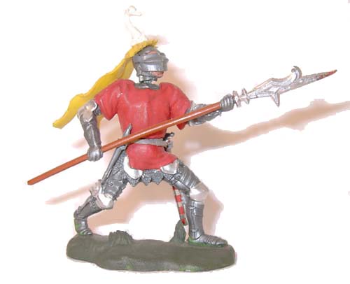
In fact the book had such a high profile that it was used as a source of reference by the model makers (rumoured to be Charles Stadden) at Britains/ Herald when in the summer of 1961 as Bobby Darin's "Dream Lover" was dominating the charts, they launched their range of Swoppet Knights.


 Swoppets which had first appeared in 1958 when a range of Cowboys soon to be followed by Indians; were exquisitely sculpted figures with interchangeable heads and torsos and accessories such as tiny pistols and knives that were removable from the miniature holsters and scabbards that held them. By the time the knights appeared some three years later a lot of the minor imperfections of the earlier models had been ironed out and the knights series is widely regarded as the best of them all. You can see Nicholle's influence particularly on the archer and also the knight with the halberd. There is more of this truly amazing  story to be uncovered over at the fascinating website; "Britain's Swoppet Knights History".


But the influences of Nicholle's book stretched across to the U.S.A. as well when model maker Aurora again used some of Nicolle's drawings as a guide to their "Knights in Shining Armour Series. Again if you check out these excellent sites you'll learn more.

More of Nicolle's work along with other Look and Learn artists can be found here: