
Bob Kane was arguably the most successful artist to sell an idea to Jack Liebowitz and Harry Donenfeld aka the publishers of DC comics. Unlike Siegel and Shuster whose experience of achieving worldwide fame as the creative duo behind Superman was tarnished by years of having to bitterly come to terms with the fact that in doing so they had lost ownership of their brain child and millions of dollars in revenue. A very late in the day and miserly annual stipend from a company that had greatly benefited from the efforts of the two Cleveland visionaries was scant consolation.
When the young Bob Kane successfully pitched the idea of a bat-winged man of mystery to Donenfeld and Liebowitz, he had the advantage of a contractually savvy adviser (Kane senior) to ensure that he continued to hold a significant financial stake in his creation. In truth, Batman was also the creation of Bill Finger, but Kane mindful of the need to keep things as simple and expeditious as possible, treated Finger as very much the junior partner, Finger would eventually die in relative poverty, while Kane transmogrified himself into a minor celebrity, on the back of Batman's success.
Part of the deal which Kane senior extracted from Donenfeld and Liebowitz was that in exchange for relinquishing ownership of Batman, his son's name would become a statutory byline in all appearances of the caped crusader. And as the work load got too intense for any single artist and writer to maintain sole production of the scores of stories required to satiate public demand a host of auxiliary artists had to sign their work with the Bob Kane flourish.
These auxilliaries included the third member of the initial Batman triumvirate, Jerry Robinson who Kane had espied selling ice creams with a hand emblazoned jacket which immediately took Kane's eye. Robinson it was who at the age of 17 joined Kane's production team, sharing an apartment with another DC artist; Bernie Klein over at 33rd Street.
In Robinson's mind the job was going to be a short term way to fund himself through college so that he could pursue his passion for writing and as demand for Batman scripts increased with the near imminent launch of a quarterly Batman comic, he set about the task of writing a story and in doing so created one of the twentieth century's most memorable villains, the Joker.
Robinson put it like this:
"The first thought that I had was to create a villain that was – we didn’t use the word
supervillain at that time – a larger-than-life villain, one that would be worthy of Batman. To set the scene, at the time we were just coming from Prohibition and the Depression in the late ‘30s and certainly the early ‘30s when I formulated my whole psyche, so who were the villains at the time? They were the Dillingers, Pretty Boy Floyd, Machinegun Kelly. They were small time bank robbers, embezzlers, hijackers. So those were most of the villains with the few exceptions of the mad scientist here and there in the comics at the time. [From my own studies of literature – English was my major – I knew that all great heroes had some (antagonist) that really tested the hero, everybody from David and Goliath, Bible heroes, to contemporary literature and classics, Sherlock Holmes and Moriarty.] It seems obvious now, but at the time it was thought by a lot of the field that if a villain was too strong – remember, we were focused on Batman, that was the new creation – that the villain would overpower Batman. Well, I had a different view, and I thought Bill was won over as a writer eventually. So that’s what I set out to do: someone who would test Batman and almost be more interesting. I always felt that heroes were essentially dull. Villains were more exotic and could do more interesting things.
I wanted somebody visually exciting. I wanted somebody that would make an indelible impression, would be bizarre, would be memorable like the Hunchback of Notre Dame or any other villains that had unique physical characters. The other major thing that I realized is as with that a lot of writers, you draw upon your life experiences in some way. Even though at 17 it was limited, I had a life before Batman. In my own family, playing cards played a big role, socially at least. One of my brothers – I had three older brothers –was a lawyer, a Yale graduate, and while he was at college, became a champion bridge player which he continued after college. So cards were always around the house. That’s one influence why I immediately thought of the Joker playing card. What preceded that was that I wanted a villain that had some attribute that was some contradiction in terms, which I feel all great characters have. To make my villain different, to have a sense of humor would be different. That’s how I came upon the name.
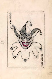
Names, of course, are very important. It’s one of the first things we try to associate with a character. At least I did. So once I thought of the villain with a sense of humor, I began to think of a name and the name “the Joker” immediately came to mind. There was the association with the Joker in the deck of cards, and I probably yelled literally, “Eureka!” because I knew I had the name and the image at the same time. I remember searching frantically that night for a deck of cards in my little room in the Bronx where I was holed up and did my work. Luckily I had it and it had somewhat the same image as the classic one, and that was the marriage. That’s how the Joker came into being."
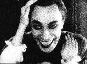
Now it has to be said that both Kane and Finger have taken credit for the Joker's creation, but Kane's testimony was always colored by the need to retain his intellectual stake in Batman. Finger as Batman's primary writer would have been involved in the development of the Joker supplemental to Robinson's groundwork and out of all three of them was the one with the real penchant for movies and had recently seen Conrad Veidt's performance in "The Man Who Laughs" and even provided Robinson and Kane with pictures of Veidt's horrific makeup for the role. Who really created the Joker will always be up for a degree of speculation but my money would be on Robinson.
Robinson's earliest art contributions to Batman were somewhat compromised by the need to retain the Bob Kane house style and so he emulated Kane's wooden figure-work to a tee. But as his confidence grew and as artists like Irwin Hasen and most importantly Mort Meskin (whose fluid artwork would prove an inspirational touchstone for Robinson) dropped around to their 33rd Street apartment to share drawing boards and deadlines, so Robinson's own distinctively lithe and pleasing style begin to assert itself on his Batman assignments.
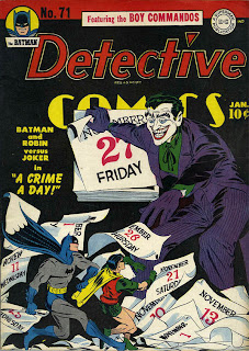
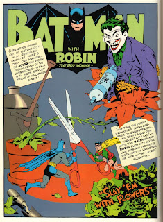
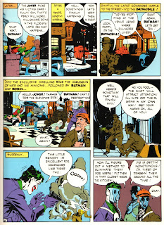
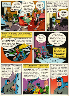
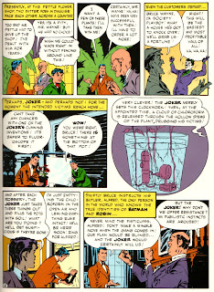
So here's an example of one of Robinson's distinctive Joker stories along with some early covers and his own initial drawing of the first (???) super villain.
All images © DC Comics 2010.
The interview with Robinson can be read in full at the excellent blog
"Rocket Llama Headquarters"

 The artistic tradition in the Wright family is a strong one, as aside from David Wright's uncle the family could trace their artistic heritage back to Joseph Wright of Derby fame and all of David Wright's three sons pursued careers in the arts, with Patrick Wright achieving notoriety as the artist behind Battle Picture Weekly's "Hellman of Hammer Force" as well as various issues of Commando pocket library, while his younger brother Paul became a noted maritime artist with scores of paperback covers to his credit.
 Their eldest brother Nicky who was the original model for Mark Lovell (brother to Carol Day's flatmate Nora) eschewed pencils and paints and turned instead to the camera. After a disastrous start as a wedding photographer, where on one memorable occasion and unable to break the bad news to his client, the father of the bride tracked the otherwise incommunicado photographer to the shed at the bottom of the garden which served as Nicky's developing studio singing in a stentorian voice, "Someday My Prin(ts) Will Come".
 Nicky quickly realized that he needed to get a bit more training under his belt and able to charm his way into any circles he fancied, managed to blag himself an apprenticeship to Dezo Hoffman who was a London based photographer of Slovak origins who had entree into all the right circles. Hoffman was also beginning to get himself a reputation as a photographer of up and coming bands. Young Nicky was sent along to meet some of the bands that Hoffman was being called upon to photograph. He met the Beatles but didn't really find them that captivating, the next band was an entirely different matter when Wright was sent to meet The Rolling Stones and their street savvy manager Andrew Loog Oldham, who having barely turned twenty was the youngest yet most clued up, member of the team.
 The resulting photograph was truly sublime, with the softly lit, almost Gainsboroughesque pose adding a degree of gravitas to a band that represented every parents worst nightmare. Frequently and totally erroneously attributed to David Bailey (who created an equally stunning image for their second LP) this remains one of those iconic frozen moments in rock history.


