 Steve Holland over at the Bear Alley Blog recently ran a posting on Matias Alonso, and the work which he showed although somewhat atypical of this great artist's output did get me thinking about my first introduction to Alonso's distinctly weirdly torrid and idiosynchratic take on comic strip art.
As regular visitors to this blog will be aware I was a child of postwar Britain and as such was regularly exposed to the pocket libraries which regaled schoolboys with tales of daring do as good old Blighty got it's tin hat on, brewed up a cup of tea and went orft to fight the Hun and the Jap.
Matias Alonso became a regular contributor to Commando comic with issue 35 and in many ways his work seemed to be the perfect embodiment of the over the top, cult of the rugged individual that Commando's editor Chick Checkley and Commando's numero uno cover artist Ken Barr had created around the title.

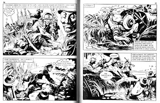
 Alonso's work was so out there that it would (and subsequently did) seem ill at ease in Fleetway's more staid titles, War, Air Ace and Battle Picture Library. Whereas a lot of the artists working from studios in Barcelona, Milan and Buenos Aires were working under the influence of Milton Canniff, Alonso seemed to be working under the influence of Burne Hogarth. Burne Hogarth whose figurework in Tarzan was a tortured depiction of figures at the extreme point of any action, full of beetling brows, rolling eyes so heavily rimmed that everyone seemed to be wearing layers of mascara, heavy black shadows, muscles taut, teeth clenched, a world in extremis. Even Hal Foster on seeing what had become of Tarzan once he had handed it over to Hogarth, concluded that old Burne had somewhat lost the plot,"All violent action looks like salad with nothing on it but vinegar - you have to have different elements".
This was evidently a message lost on Matias Alonso, in comparison to Alonso's work Hogarth's work seemed relatively sedate. Alonso was like Hogarth on amphetamines and in terms of Commando perfect.
Illustrating the start of this post are a couple of spreads from some early issues of Commando - "Burma Johnny" (note the flipped perspective with the moon in the right hand panel) and "Man Trap" (brilliant story). It's all there but part of the reason that this stuff never seems to get reprinted is the definitely non PC Japanese soldiers, I mean even in terms of war time posters these guys are pretty close to the edge. But so is Alonso's work and that's what makes it great.
And here courtesy of The Loft are some truly superb examples of Alonso's work, where the debt to the U.S. influence is clear to see. So after you've drooled over these examples get your ass over to Grandpa's loft and see what else he has in store for you.


Intriguing stuff as usual, Peter! I would never have known the same artist did those covers and the b&w interiors - which really are perfect Commando material, as you say. The sudden flip of angle in the panel with the moon gives it a disturbingly nightmarish quality, too.
ReplyDeleteWell Dave, bearing in mind our shared enthusiasm for all things Warren you might be intrigued to know that Mathias Alonso shared studio space with Luis Bermejo famed for his artistry on The Rook. Alonso would frequently assist Bermejo with inking chores and the results were always very tasty.
ReplyDeleteIt's just a pity that none of those collaborations (to my knowledge) included Bermejo's Warren work.
Peter, as a non-artist I have to ask another question. I notice a few instances of Senor Alonso using a hand gesture with the two middle fingers held together (like an inverted Vulcan greeting). I used to associate this with Ditko, then I noticed that Leo does it in Mirabilis too - and he's no Ditko fanatic like me. So what's with this? Do you artist chaps all go on a mystical course taught by the Ancient One in a Tibetan temple or what? :-)
ReplyDeleteBy Jove you're right Dave!
ReplyDeleteHmmmmmmm ... lights Meerschaum pipe, Holmesian brows furrowing, magnifying glass to the fore.
Now if you attempt this manuoevre it causes distinct discomfort and is just plain silly.
But in terms of drawing it breaks up the outline of the fingers without the misery of the artist having to draw all the fingers separately.
I think...
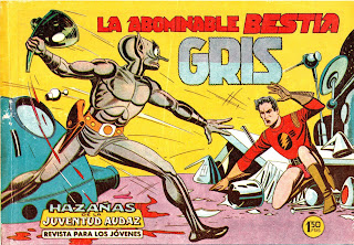
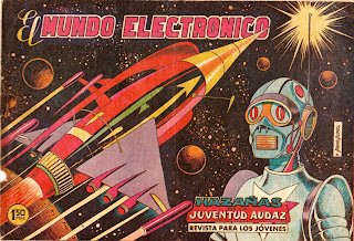
I love those Spanish covers for Hazañas de la Juventud Audaz, which seem to be clearly based on the clean-cut, impossibly sleek vision of the future established by Alex Raymond for Flash Gordon then refined by the likes of Barry, Wood, Anderson, Manning, etc.
ReplyDeleteThe odd thing is that, like Dave, I would have been hard pressed to identify this early SF work with Alonso's later Commando pages, which seem to have grown out of an entirely different tradition. Maybe it's my imagination but 'Burma Johnny' appears to have far more in common with Breccia's 'New Look' than anything that came out of America - even down to dramatic slashes cut into the paper.
(ps - Having just noticed Dave's question about the arcane hand gestures it's perhaps worth mentioning that Stainless Steve was himself heavily influenced by the sinew-bursting anatomy of Burne Hogarth's Tarzan!)