OK the time has come - the time to stop dickering around and to come straight out with the reason for my somewhat spasmodic postings on this dear old bloggity thing.
So cue drum roll...
Bompity, bompity, bompity, bommmmmbbbbbbbbbbbb ...
Peal of trumpet.
Prrraaaaddddaarrrrpppppppp!!!!
Golden shaft of sunlight.
Falling onto ...
A new publication due to be launched by Book Palace Books next year and it's dedicated to a subject dear to many of us - illustration.
Angelic choir...
Illustrators for that is the name of our new journal is dedicated to spreading the word about some of the most iconic images ever to see print. In the pages of Illustrators you will read about some of the most inspired artists to commit their art to print. These are the people who with brush, pen and pencil were capable of transporting their audiences to the farthest reach of their imaginations. The audiences that many of these artists were catering for were international, their work was collected and admired by readers the length and breadth of Europe and the US. But with the passing of years and the ascendancy of new media, much of this brilliant and inspirational work is falling from the collective conscious.
Illustrators will remedy that by presenting you with a publication that four times a year will guide you through the stories behind these artists, the publishers that commissioned them, the agents that promoted them, the friends and partners that posed for them and the crazy stuff such as the artist who created his incredible covers in an unfurnished bedsit with a parrot for company. All this and more will be revealed in each edition of Illustrators. These features written by some of the most eminent enthusiasts of this oft neglected art form will provide a contextualization to the truly fabulous artwork which we will be presenting you with in each and every issue of Illustrators. Wherever possible we will be bringing you scans of some of the most incredible examples of original artwork by the artists concerned. Early issues of Illustrators will be bringing you the art of Fortunino Matania, Reginald Heade, Chris Foss, John Millar Watt, Luis Garcia, Jordi Penalva, Giorgio De Gaspari and Graham Coton, as well as artists who although equally brilliant are in many ways unknown and unsung. With contributions from writers and artists such as David Roach, David Ashford, Steve Holland, Rian Hughes and Norman Wright as well as access to many of the artists and/ or their agents and their families we aim to provide the most authoritative insight into the stories behind the UK and Europe's most inspired and inspirational artists. Our first issue debuts with a feature on Denis McLoughlin and an interview with the legendary Ian Kennedy looking back on his sixty two years in the business.
We'll keep you posted as we get nearer to publication date but in the meantime here's a taste of things to come (Please note these illustrations are for display purposes only and may be subject to change upon publication):
Monday, 26 September 2011
Thursday, 22 September 2011
Rahbinnn Hood, Rahbinn Hood, Rahdin' Threw The Glen
I can hear it as I type, Dick James singing the song of Robin Hood as Richard Greene pulled back his draw string and unleashed his arrow which hurtled - Pertoingggggg!!!!
Not into the gizzard of some rascally Norman, after all it was Richard Green portraying the Outlaw of Sherwood and being a jolly decent sort of fellow he would only turn the Sheriff of Nottingham's men into pin cushions in extremis. Rather it was the trunk of an old English Oak tree into which the arrow kerzoinked.
The year was 1955 and Lew Grade had gambled a sizeable amount of his resources on producing a TV series which would launch his ATV company into the premier league. Mind you, not that Grade's budgetary commitment was limitless, the tight purse strings plus the even tighter shooting schedule precluded fancy sets, but with the involvement of Hannah Weinstein as producer and some superb scriptwriters including some US wordsmiths whose Hollywood contacts had dried up in the wake of the McCarthy hearings, the series was a hit on both sides of the Atlantic. Much to the relief of Grade and his backers.
Here's an example of the first episode as it was shown on US TV - sadly minus the talents of Dick James, ousted in favor of a sponsor's endorsement for Wildroot Hair Oil.
The Rahbinn Hood, phenomenon did not go unnoticed by one of Amalgamated Press's most inspired and visionary editors, Leonard Mattthews. He loved swashbuckling films and literature and wanted to exploit the Robin Hood craze which was gripping the nation. He didn't have the rights to the ATV version of the legend, but that didn't matter, he could create stories around the Robin Hood legend as opposed to the Richard Green portrayal.
And anyway, the version of Robin Hood that Leonard Matthews loved was the Errol Flynn version, which was the motif he impressed on artists such as John Millar Watt, surely one of the UK's most underrated illustrators, when he commissioned these images for publication in the late 1950's.
Friday, 16 September 2011
Stop Press - More Commando Coverage in Tomorrow's Telegraph!
News from Calum Laird at Commando HQ:
There will be a feature on Commando in tomorrow's Telegraph Review section.
Images © DC Thomson 2011
There will be a feature on Commando in tomorrow's Telegraph Review section.
Images © DC Thomson 2011
Thursday, 15 September 2011
Google and the Golden Gob Iron
Last month at the Edinburgh Book Festival, Ewan Morrison set out a very bleak thesis on what the internet had to offer writers.
His assessment was that new technology was democratizing the arts but almost as an inverse consequence the returns were shrinking to the point where as he famously put it as regards author's advances, "10k is now the new 50k".
The outlook for unpublished authors was even grimmer, how J.K. Rowling would have made it these days is a moot point.
Anyway if you want to cheer yourselves up here is the article in full.
Part of Morrison's assessment of where this was all leading us was that labor on the internet is provided for free. Nowhere is this more true than blogging, where people are so keen to share their thoughts that they will happily type away for ages with a nice warm glow because they can opine and people will read their opines. Morrison's thesis is that the only people who really are making money off the back of the arts are the ISPs such as Google and Google are the people that were seriously pushing to digitally scan every book ever published to create the ultimate free cyber library. The plans have been ardently resisted and everything is in temporary abeyance but they haven't gone away completely.
But if you look at the arts in general you will pretty much find anything you want out there, labor provided for free by people keen to share their talents and enthusiasms for just the extra buzz of having an audience beyond their bedrooms. YouTube is an exemplar of this phenomenon, there are countless channels set up by bedroom wannabes, who are happy to expend a lot of energy doing Mariah Carey and Lady GaGa re-treads in the hope of perhaps securing the elusive record deal without suffering the angst of standing in front of Simon Cowell. Every street in the land has now got it's own mini recording studio and the results although often dire are all out there to share for free.
But while the serious earners such as Coldplay try to work out clever schemes by which to give away their latest album without forcing themselves to take day jobs, there are other musicians who long ago gave up on that dream and plumped for a solid day job instead. Here's just such an example:
Hakan Ehn is a Swedish engineer, so has got the day job well and truly sorted, but his other passion is playing blues harmonica and his over riding big influence seems to be Little Walter, who although he lived on the edge and eventually died as a result of one brawl too many, was an absolute genius when it came to pushing amplified harmonica to levels hitherto undreamed of in the 1950's. Hakan Ehn has adopted a lot of Walter's love of amplified harp and using a small Roland amplifier occasionally deserts his kitchen with T-Bone steak gently simmering and heads out for the metropolis.
He will then set up his equipment; Roland amp, i-pod with backing track, Shaw mic and Hohner (in this example Golden Melody) Harmonica and unleash full on down and dirty Chicago Blues. Here he is at London's Tottenham Court Road Tube station:
You can see where Hakan's love of finding out how things work comes into play. By using a small amp he can get a nice sense of distortion by over-riding the little amp and he's not averse to tiddling around with the draw holes on his Marine Band harmonicas to get even more out of his playing.
The irony is that without free entertainment on the internet we wouldn't be able to check out artistes like Hakan Ehn, but for artists without back up income, making money out of their art via the new technology the prospects are challenging to say the least.
Tuesday, 13 September 2011
Blogdom's Silent Service
This blog posting is respectfully dedicated to one of those unsung heroes of BlogDom, Mr Malcolm Norton. Over the months and years that this blog has grown from being just a chubby cheeked infant to pock marked adolescence, Malcolm has been contributing scans and suggestions for future postings.
It has been because of Malcolm's unstinting work that I have been able to reprise you chaps with early Eric Parker artworks from the Union Jack boy's paper published during those fabulous far away days of flapperdom. It was Malcolm that forwarded scans of penny dreadfuls, his passion for the golden age of British Boy's papers and comics seems boundless. This might be partly because by some weird quirk of fate he is stuck in a zone of endless sun, where even mad dogs retreat to the shade.
Out of the many artists whose work Malcolm enthuses over there is one in particular whose brilliance seems to outshine all other contenders for his unquenchable devotion.
That artist is this man:
and once you have all shared with Malcolm the joy of seeing one of UK comicdom's most talented yet self effacing artists on video you can also check out the latest offerings from the battle scarred offices of the UK's sole remaining publisher of pocket war comics.
Commando's 50th Birthday Bash is certainly the most memorable and best sustained piece of promotion that has been accorded this comic in it's long and distinguished history.
Images © DC Thomson 2011
Commando No 4427
Sons And Fathers
There they stood, back-to-back, Beretta sub-machine guns stuttering as they fought for their lives.
It had been the same many years before as their fathers had battled shoulder-to-shoulder in a heroic but doomed last stand.
Would history repeat itself? Or was there another twist to the tale?
Story: Mac MacDonald
Art: Vila
Cover: Janek Matysiak
Commando No 4428
The Panther’s Claw.
After a run-in with his boss’s snooty, arrogant son, young Joe Gallagher quit his factory job. He wasn’t bothered, though, he’d wanted to join the Royal Engineers anyway.
Trouble, however, seemed to follow him wherever he went. But that nothing compared to the danger Joe and his Churchill AVRE crew faced against a ruthless, fanatical Nazi and his squadron of a deadly tanks…
THE PANTHER’S CLAW
Story: Peter Grehan
Art: Morahin
Cover: Ian Kennedy
Commando No 4429
Boss Of The Sky
Flight-Lieutenant Alvar Brenner was a real mystery to his fellow fighter pilots in the RAF squadron he flew with. He came from Balkovinia, a country very few of them had even heard of. And when he first went into action with them, he seemed to know every move the German pilots would make — as well as just how their aircraft would perform.
So they all began to wonder where he’d learned all this…and whether he might just be a Nazi spy planted in their squadron…
Introduction by Calum Laird, Commando Editor
A couple of years ago, I found a box of my own Commandos lurking at the back of the garage. Goodness knows how many times I’ve moved them from house to house. When I went through them though, I knew there was one missing.
Like many a Commando reader before me I just could not remember its name so it was a great surprise to stumble into it while looking for something else.
Re-reading it was not a disappointment. The Wilkinson/Mira combination provided an intriguing plot and crisp, accurate line art. Ken Barr has seldom done a better cover for my money. Hidden treasure indeed.
Boss Of The Sky, originally Commando No 347 (August 1968), re-issued as No 1063 (September 1976)
Story: Wilkinson
Art: Mira
Cover: Ken Barr
First published 1968 No 347
Commando 4430
‘Mad Schultz’ – He Shot The Union jack To Ribbons!
Out of nowhere they appeared, miles behind the front line, falling on undefended convoys like wolves on a flock of sheep. Machine-guns blazed, trucks were blasted to pieces, and men fell in roadside ditches. Then they were gone as swiftly as they come, and yet another British supply column was left a smoking ruin.
They were German guerrilla fighters, trained killers every one, and they were led by a man as fearless and cunning as any. Captain Schultz was his name — special Nazi commando.
Soon the question was on every British soldier’s lips…where will Mad Schultz strike next?
Introduction by Calum Laird, Commando Editor
While we were scouring the Commando archives for the material we needed to put together “Commando: 50 Years a Home For Heroes” the cover of this book was brought out for scanning.
Now, you have to admit that, whatever else it might be, it’s an eye-catching illustration. So, with the doors to the vaults standing open, I had to reach in for the copy and take it away for a read. I had to, you understand, it would have been dereliction of duty otherwise.
The hard-hitting Redbridge story lives up to the promise of Ken Barr’s cover and Lopez’s inside artwork has a dark quality which really suits the story even if his touch is a little cartoon-like in places.
The icing on the cake is that line under the title though, “He Shot The Union Jack To Pieces.” Priceless!
Mad Schultz, originally Commando No 65 (April 1963)
Story: Redbridge
Art: Lopez
Cover: Ken Barr
Sunday, 11 September 2011
Blackjacked and Pistol Whipped!
It was a couple of years ago when this blog was still in it's infancy that I made a posting about the truly bizarre story of Charles Biro and Bob Wood and their creation and editorship of the infamous comic Crime Does Not Pay. The fact that the story of the rise and fall of this comic book sensation had the most bizarre epilogue when Bob Wood, brutally murdered his then partner after an epic drinking spree at an otherwise genteel hotel in New York, added a further twist of salaciousness to the whole story.
I am really thrilled that two years later there is finally a collection of these utterly appalling comics issued by Dark Horse. Wrapped in a truly superb pastiche cover by ace designer Peter Poplaski of the infamous moment in Room 91 at the Irving Hotel, Blackjacked and Pistol Whipped reprises a collection of the best (if best is the right term) of these stories which at times come across like Struwwelpeter for wiseguys. The book focuses on the early years of the series from 1942 to 1948 and wisely avoids the later more anodyne stories as the forces of reproach began to wag their fingers in the direction of Biro and Wood and their indulgent publisher Lev Gleason, who adhering to socialist principles, actually cut his creative team in for a piece of the action (as in profits).
The book is a compelling read, not least because the editors have created a book whose lively design and informative text add greatly to the impact of the book by brilliantly contextualizing the stories they reprise. There is an excellent introduction by Brian Azzarello and Denis Kitchen (who I am honored to say, does occasionally post comments on this blog) also adds a truly revelatory history of the comic and it's hustlers made good editors, Biro and Wood. The comics themselves are crisply and sympathetically restored, so colors and line work are sharp rather than straight scanned with dot screen and browning paper.
The stories themselves lack the nuances of EC's Feldstein and
Craig scripts, and characters are wooden and two dimensional as was standard for mid nineteen forties comics. But where the series comes alive is with the introduction of Mr Crime, who although he predates EC's horror hosts, the Cryptkeeper, the Old Witch and the Vault Keeper, is every bit as powerful and charismatic as the ghoulish threesome. I remember that my first introduction to this character was in Les Daniel's COMIX, which reprinted Baby Face Nelson Vs The U.S.A. (unfortunately not included in this selection). That story had me hooked from the get go and it was Mr Crime that made the tale so compelling.
There are some fascinating examples of early Dick (Frankenstein) Briefer , as well as early Carmine Infantino, plus the relative oldsters such as Fred Guardineer (doyen of early Action and Detective covers). However it is the work of the young and talented rising stars such as George Tuska and Dan Barry that really hit the nerve.
My only slight regret is that more of Biro's covers were not included, there are a few but not enough bearing in mind that Biro's covers were the shop front for this comic and although some of them were undoubtedly crude and poorly composed, others such as the death of Baby Face Nelson are superb in their design and (if this isn't too tasteless in this context) execution.
Execution being the ultimate fate of many of the protagonists of Blackjacked and Pistol Whipped.
Tuesday, 6 September 2011
The Definitive Barks Collection???
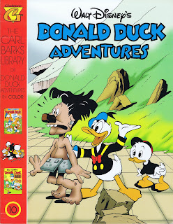
I, along with many others in the blogosphere, have been enthusing over Fantagraphics newest Disney project. This is to reprint all the Gottfredson Mickey Mouse strips and if that was not enough cause for celebration then the second prong in their intent to share the best Disney comics with as wide an audience as possible their plan to publish all of Carl Barks legendary Duck comics. Starting this autumn/ winter with a collection from the peak of Bark's creative output with stories from the 1948-49 era including such classics as Lost in the Andes and Race to the South Seas. The latter story was hellishly rare as it had only been available as a March of Comics giveaway and until the stories were reprinted firstly by Russ Cochran and Bruce Hamilton and then later by Gladstone, this story used to command premium prices amongst collectors anxious to see one of the pivotal moments in the Gladstone, Donald relationship.
The story was also mega rare because at the time Western publishing had no desire to reprint the thing as some of the islanders depicted seemed to fall into the racial stereotyping quagmire and it wasn't until Oberon in Holland decided in the late 1970's to reprint ALL the Barks classic stories that this tale was dusted off and represented with the aid of genius draftsman Daan Jippes tracing some very shoddy photostats of the original comic.
So in the late 70's and throughout the 80's if you wanted stories like this one or Voodoo Hoodoo which is also appearing in this volume of the Fantagraphics collection you had to teach yourself Dutch and invest in a pile of Dutch Ducks.
So thank goodness for Fantagraphics as for the first time we are going to get the whole series of these stories in affordable format and with a very sympathetic coloring job provided by Rich Tommaso. Fantagraphics have provided a downloadable PDF of the new baby which you can access here.
My only slight (well perhaps more than slight) beef is with the cover image. Their original promo showed a cover which was to all intents and purposes a straight lift (bar lettering and recoloring) of Barks original classic cover design. This might seem lazy and non creative, but it was actually the way to go, designers are functionaries on jobs like this. They are acting as MC's to the main performance and as such they should cleave to the principle that less is more and not try and grab the spotlight themselves by attempting to be too clever and assembling elements of the artist's creation in ways which they were not intended to work. This is precisely what has happened with the new cover design, which falls into the same trap as the earlier Gladstone series by cobbling together portions of Barks' story panels to try and create a new cover image - this just doesn't work. The beauty of using artwork which was designed to fulfill the function of a cover is that it's already designed to do the job you request of it. And it conforms to that most important design principle;
Less is More.
That being said I will say that designer Jacob Covey has done a sterling job in constructing a Barksian feel to all the elements he has assembled and the letter forms look really lovely, neatly complimented by the clean and unfussy color scheme. It's also worth pointing out that Fantagraphics will be including all of Bark's covers, which again gives this collection the edge over it's Gladstone predecessor in terms of completeness.
My only other slight concern at the moment is the interpretation of the simpler palette which typified Western printings treatment of these stories when they first appeared. Light yellow was one of the main colors employed. It added brightness without getting too citric. Full on 100% yellow was used on much smaller areas. In the sample posted on their PDF RichTommaso seems to have drifted into using the full on sherbert hued yellow rather than the more laid back yellow which is required. Hopefully this is just a minor aberration. The rest of the pages look lovely and again as with Prince Valiant (and Book Palace Books Wulf the Briton) they appear to be using that lovely off white matte archival paper to help present the pages in as sympathetic a way as possible.
Can't wait to see the finished product.
In the meantime check out Rich Tommaso's Web of Comics - excellent reading (and viewing!).
Here for your edification is a comparison with the Fantagraphics pages first, followed by the pages from the original Western comic followed lastly by Gladstone's treatment.
Thursday, 1 September 2011
Commando's Half Ton Truck Keeps On Rolling
More on Commando celebrations from Commando HQ as an exhibition of Commando artwork under the title Draw Your Weapons is launched at the National Army Museum in Chelsea, London.
And as promised, here is a run down of the four latest Commandos too hit the shelves:
Commando 4423
MERCY FOR NONE!
Sitting tensely together in the Dakota on their way to the night drop into Occupied Europe, ten hand-picked paratroopers jokingly nicknamed themselves the ten little soldier boys. Fate must have smiled, for it turned out to be a grim and deadly jest.
One by one, at the hands of the Nazis, they were picked off. One by one, they died the death of heroes…
Mercy For None!
Introduction by Calum Laird, Commando Editor
They say that gallows humour is the darkest of all. And this story has the blackest stripe of that type of humour running right through it. As the paras at the centre of the action begin to meet their fates, one of their numbers starts to recite a macabre rhyme which can have only one fatal ending.
Artist Gordon Livingstone, in one of his earliest outings for Commando, enhances the darkness of the tale with generous use of black ink while cover artist Ken Barr leaves you in no doubt that there’s plenty of action waiting inside.
Classic Commando — you can see, and read, why they were such a runaway hit from Day One.
Originally Commando No 4 (July 1961), re-issued as No 2547 (March 1992)
Story: Castle
Art: Gordon Livingstone
Cover Art: Ken Barr
Commando 4424
TUNNEL OF DOOM
Flat on his stomach on the railway line, Private Andy Morgan crawled forward grimly. It was up to him to stop a Nazi armoured train — and all he had to do it with was one single hand-grenade.
And what made it even tougher for Andy was that the only two guys with him were the type who would pack up and run if things got dicey.
Introduction by Scott Montgomery, Commando Deputy Editor
In this brilliant tale we meet a couple of ne’er’do’wells who seem to positively revel in their bad attitude and lack of discipline. The aptly named Dodger Harland and Scrounger Dunville are classic Commando characters and it’s not long before they’ve had a bad influence over Andy Morgan, our fledgling hero.
However, when push comes to shove, perhaps these two aren’t quite what they seem…Redemption is a common Commando theme and this cracking story, with its gritty interior art and a superbly painted cover by Penalva, has an eerily original spin on it.
Originally Commando No 450 (January 1970), re-issued as No 1271 (November 1978)
Story: Allan
Art: Bielsa
Cover Art: Jordi Penalva
Commando No 4425
What do you get if you send a marauding, aristocratic “Toffs Brigade” on a race against time to recover their stolen regimental silver?
You get a rip-roaring adventure, that’s what!
And if that’s not enough, don’t forget to add a battered but trusty Bedford QL lorry nicknamed “Queenie”…better known as the
PRIDE OF THE DESERT
Story: Alan Hebden
Art: Benet
Cover Art: Benet
Commando 4426
Killer Condor
“Relax, it’s one of ours.” So said the U-boat’s look out as the looming shape of a Focke-Wulf Condor appeared over them.
Unfortunately the crew of the bomber didn’t seem to realise that the sub was on their side for its lethal payload was soon tumbling down to bring destruction and death to the men below.
The Killer Condor had struck again but surely at the wrong target…
Story: Mac Macdonald
Art: Carlos Pino
Cover Art: Carlos Pino
All images © DC Thomson 2011
Subscribe to:
Posts (Atom)