Manga'esque comic strip/ graphic novel devoted to the adventures of three teenagers, Cary, Gina and Rabby whose dystopic and dysfunctional existence is alleviated via their online exploits in the cyber world of Cloud 109.
These exquisite and perverse illustrations come from another collection of Patrick Wright cartoons, which appeared in 1992 under the title "Worthless Pursuits". They were drawn a lot larger than the measly size that the publisher opted for, so I've scanned them in at hi-res so you can savor every sublimely sordid detail.
Check out these promo videos by Oasis for "Live Forever"
and The Charlatans for "Just When You Think Things Are Over"
and you'll see a couple of homages to a film that almost never saw the light of day.
"Performance" is often credited as being the work of Nicholas Roeg and in truth he was responsible for a lot of the camerawork, but the overall vision and perverse dynamic which eventually saw the film to completion despite the obstacles placed in it's way was a man whose cinematic C/V was minimal to say the least. Donald Cammell was part of that upper crust echelon of British Society that embodies old money heading to hell in a bohemian hand cart. He had initially enjoyed a certain amount of success as a society portrait painter in the late '50's but had rapidly tired of this and had decided that cinema was the future. He lived an extraordinarily hedonistic life style throughout his twenties and bedded a succession of actresses and models including Barbara Steele who provided the model for Jim Steranko's Madame Hydra.
"Performance" was in many ways a distillation of all that Cammell held dear, reflecting his fascination for people on the fringes of society and gangsters and rock stars in particular. He was already friends with the hypnotically seductive Anita Pallenberg, who by the time "Performance" was in production had jettisoned Brian Jones in favor of Keith Richard. But key to the feasibility of the project was securing the involvement of Mick Jagger, who Cammell also had started to hang out with. With Jagger's name on the credits came the key to finance and with the young and well connected Sandford Lieberson acting as the Hollywood go-between, Warner Brothers agreed to fund the project on the assurance that Nick Roeg would at least co-direct the film, with current hot young actor James Fox on board as well.
Now with money, Cammell started in earnest and proceeded to create a vision of bohemian squalor on which to work his story of a London gangster shifting identities with a dissolute and faded rock star. Fox, whose previous cinematic incarnations had been decidedly middle class, threw himself into the role of a violent East End thug with admirable intensity and just to spice things up, met up with real life gangsters, such as the superficially charming but implacably violent John Bindon, who appears in the clip below as the character putting his head around the door and saying;"excuse me?"
The film is also laden with references to some of Cammell's art passions such as Jorge Luis Borges and the work of the painter Francis Bacon - the tableaux in the closing shot of the "Memo From Turner" excerpt says it all really.
Rolls of film were consumed as work proceeded and came the moment when Sandy Lieberson couldn't forestall the thing any more - the old guys from Warners wanted to see what they were shelling out on, so a screening was arranged.
When the suits saw what Cammell and Roeg had dished up for them they were appalled at the scenes of depravity, violence and sheer weirdness that they were obliged to endure as the film danced in front of their eyes for longer than was commercially viable for any audience beyond even the most dedicated art-house viewer. "Why even the goddamn bath water's filthy" spluttered one exec as he watched the scene of Jagger sharing a bath with Michelle Bereton and Anita Pallenberg.
Perhaps cognizant of the awful fate which befell Powell and Pressberger on the first night screening of "Peeping Tom" when their careers slid ingloriously down the pan as the audience of the great and the good departed in silence, Roeg started to distance himself from the project as Cammell realised that he was going to have to make some fairy brutal cuts to the film if it was ever going to be released.
The hope for Cammell was that as much as the suits loathed the film, they were perhaps prepared to give it some kind of release if he could just ditch large chunks of the opening half of the film so that Mick Jagger could work a bit of box office magic by appearing a lot earlier in the film than the current cut allowed.
Roeg whose connections were truly international had the name of an actor named Frank Mazello who had appeared with James Dean in "The Wild One" as someone who might be able to help him on the editing of the film and as it turned out Mazello was a godsend. It was he that created (through sheer necessity) the splintered and subliminal edits which give this film much of it's allure some forty plus years later.
The film languished for a further year until Altamont and the film "Gimme Shelter", propelled the Rolling Stones back into the frontal lobe of international consciousness.
And even then it struggled although it did with some irony become a real favorite on the art-house circuit. But unlike a lot of it's contemporaries such as "Blow Up", Cammell's film doesn't show it's age, it's as involving and engaging now as it was when it was first released.
The following is very much representative of the new wave of writers which Warren magazines hosted in the wake of the absorption of more challenging counter culture ideas and lowering of censorship taboos in the wake of films such as The Exorcist.
Disaffected youth reacting against the hypocrisy of the older generation, with a bit of Bible Belt lunacy thrown in - lovely artwork by Richard Corben but not the most satisfying of story resolutions as regards Gerry Boudreau's script though...
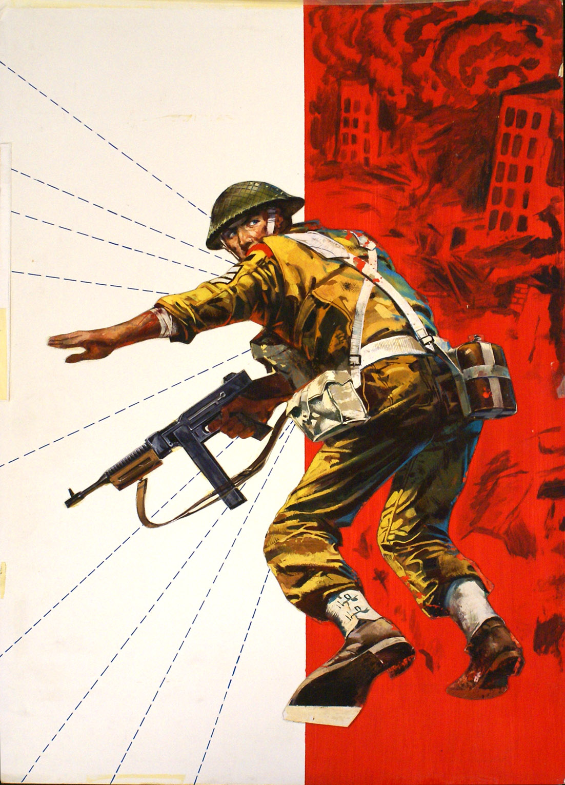
Just one image from the original artwork which I think proves beyond any doubt that Ron Embleton's Wulf the Briton strip was in a league of it's own. When this image appeared in late 1959 a succession of truly awesome Wulf covers had eclipsed even the best output of the Hampson studio. Never had artwork of this caliber been seen in a UK comic and for comic creatives such as Frank Bellamy, Don Lawrence, Mike Noble and John Burns, Embleton had yet again raised the bar.
Unbelievable that this strip has fallen out of the collective comic consciousness for so long.
But not for much longer; all the work (including several eleventh hour additions!) for the Wulf book published by Book Palace Books has now been completed and the approved files will heading off to the printers by the end of the week. Two editions including a luxury limited signed and numbered red leather, slipcased edition with 24 extra pages devoted to reproductions of some truly stunning Wulf original artwork will at last collect together all of Ron Embleton's Wulf The Briton, with some truly insightful contributions from friends and associates of this remarkable artist.
Jordi Penalva's paintings for Fleetway war comics were almost ubiquitous by the late 1960's, he then proceeded to work for rival publisher DC Thomson where he created equally powerful covers for Commando comics.
An excellent write up on Penalva appeared a few years ago on Peng Leif'sblog courtesy of David Roach - co-author along with Jon B. Cooke of the Warren Companion, which also includes Penalva in it's listings, as he also contributed along with a lot of other ex War Picture Library artists to Warren's magazines.
Here's some other originals which slipped through the Carlton books net.
Rome based artist Alessandro Biffignandi moved away from illustration in the early 1980's to concentrate on oil painting, but by then he's said as much as he'd wanted to say in terms of commercial art. His output for the Fleetway pocket libraries was just astonishing and as his work matured his style developed this beautiful very loose brush work where he seemed to sculpt the forms that he was depicting.
Here's some examples of those early years for Fleetway (we're talking here early '60's) with some of the war pocket library covers that didn't make it into the two recent Carlton books.
Illustrator and collaborator with the author David Orme of the adventures of Gina, Cary and Rabby as they attempt to navigate the perilous cyberworld of Cloud 109.


 "Performance" is often credited as being the work of Nicholas Roeg and in truth he was responsible for a lot of the camerawork, but the overall vision and perverse dynamic which eventually saw the film to completion despite the obstacles placed in it's way was a man whose cinematic C/V was minimal to say the least. Donald Cammell was part of that upper crust echelon of British Society that embodies old money heading to hell in a bohemian hand cart. He had initially enjoyed a certain amount of success as a society portrait painter in the late '50's but had rapidly tired of this and had decided that cinema was the future. He lived an extraordinarily hedonistic life style throughout his twenties and bedded a succession of actresses and models including Barbara Steele who provided the model for Jim Steranko's Madame Hydra.

 Now with money, Cammell started in earnest and proceeded to create a vision of bohemian squalor on which to work his story of a London gangster shifting identities with a dissolute and faded rock star. Fox, whose previous cinematic incarnations had been decidedly middle class, threw himself into the role of a violent East End thug with admirable intensity and just to spice things up, met up with real life gangsters, such as the superficially charming but implacably violent John Bindon, who appears in the clip below as the character putting his head around the door and saying;"excuse me?"

 Perhaps cognizant of the awful fate which befell Powell and Pressberger on the first night screening of "Peeping Tom" when their careers slid ingloriously down the pan as the audience of the great and the good departed in silence, Roeg started to distance himself from the project as Cammell realised that he was going to have to make some fairy brutal cuts to the film if it was ever going to be released.
 The hope for Cammell was that as much as the suits loathed the film, they were perhaps prepared to give it some kind of release if he could just ditch large chunks of the opening half of the film so that Mick Jagger could work a bit of box office magic by appearing a lot earlier in the film than the current cut allowed.
 Roeg whose connections were truly international had the name of an actor named Frank Mazello who had appeared with James Dean in "The Wild One" as someone who might be able to help him on the editing of the film and as it turned out Mazello was a godsend. It was he that created (through sheer necessity) the splintered and subliminal edits which give this film much of it's allure some forty plus years later.


 But not for much longer; all the work (including several eleventh hour additions!) for the Wulf book published by Book Palace Books has now been completed and the approved files will heading off to the printers by the end of the week. Two editions including a luxury limited signed and numbered red leather, slipcased edition with 24 extra pages devoted to reproductions of some truly stunning Wulf original artwork will at last collect together all of Ron Embleton's Wulf The Briton, with some truly insightful contributions from friends and associates of this remarkable artist.


