I blogged several months ago about an exquisite and long forgotten newspaper strip that adroitly captured the sophisticated milieu of post war London via the fraught relationships of it's central character and namesake; Carol Day. "Carol Day" was as you will recall the brainchild of the artist David Wright, who had left school and commenced work at his uncle's studio, where his talent soon manifested itself and following on from being a very successful fashion illustrator he soon started veering in the direction of comic strips such as "Judy" which appeared in the popular weekly magazine, Tit Bits". "Carol Day" which first started appearing in the Daily Mail in 1956 proved the most popular of all Wright's strips as well as being his best realized, the quality of both his scripting and his artwork were without peer, it is really a great shame that the majority of comics enthusiasts are still unaware of it and comic historians should hang their heads in shame. There is Roger Clark's excellent website devoted to David Wright and Carol Day at http://carol-day.com and both Steve Holland and David Roach have written some excellent pieces on this subject along with artist Brian Bolland who has always had high regard for Wright's work.
The artistic tradition in the Wright family is a strong one, as aside from David Wright's uncle the family could trace their artistic heritage back to Joseph Wright of Derby fame and all of David Wright's three sons pursued careers in the arts, with Patrick Wright achieving notoriety as the artist behind Battle Picture Weekly's "Hellman of Hammer Force" as well as various issues of Commando pocket library, while his younger brother Paul became a noted maritime artist with scores of paperback covers to his credit.
Their eldest brother Nicky who was the original model for Mark Lovell (brother to Carol Day's flatmate Nora) eschewed pencils and paints and turned instead to the camera. After a disastrous start as a wedding photographer, where on one memorable occasion and unable to break the bad news to his client, the father of the bride tracked the otherwise incommunicado photographer to the shed at the bottom of the garden which served as Nicky's developing studio singing in a stentorian voice, "Someday My Prin(ts) Will Come".
Nicky quickly realized that he needed to get a bit more training under his belt and able to charm his way into any circles he fancied, managed to blag himself an apprenticeship to Dezo Hoffman who was a London based photographer of Slovak origins who had entree into all the right circles. Hoffman was also beginning to get himself a reputation as a photographer of up and coming bands. Young Nicky was sent along to meet some of the bands that Hoffman was being called upon to photograph. He met the Beatles but didn't really find them that captivating, the next band was an entirely different matter when Wright was sent to meet The Rolling Stones and their street savvy manager Andrew Loog Oldham, who having barely turned twenty was the youngest yet most clued up, member of the team.
For Nicky it was love at first sight and while Dezo concentrated his lens on the fab four, Nicky's attentions were chiefly orientated towards the Stones and following a succession of photo calls it was soon time to create the cover image that would launch their first LP - and all for the princely sum of £25.00. A big deal job indeed, which called for a bit of extra thought on Nicky's part.
It so happened that Nicky was renting a ground floor room from the actor Tom Bell whose role as Toby in the "L-Shaped Room" had attracted a lot of critical acclaim and Bell's lovely missus whose seductive charms did not go unnoticed by the young Wright was his de-facto landlady. An additional delight for the photographer's eye was the truly gargantuan and very grand fireplace that his room hosted and it was here that Nicky decided to place the Stones.
The resulting photograph was truly sublime, with the softly lit, almost Gainsboroughesque pose adding a degree of gravitas to a band that represented every parents worst nightmare. Frequently and totally erroneously attributed to David Bailey (who created an equally stunning image for their second LP) this remains one of those iconic frozen moments in rock history.
Manga'esque comic strip/ graphic novel devoted to the adventures of three teenagers, Cary, Gina and Rabby whose dystopic and dysfunctional existence is alleviated via their online exploits in the cyber world of Cloud 109.
Saturday, 31 July 2010
Thursday, 29 July 2010
"Just Whistle While You Work" - A Brief Encounter With Disney Songbooks
Nowadays Disney iconography is so ubiquitous, it's forever in your face. It wasn't always thus, beyond the immediate perennial face of Disney Enterprises, Mr Mickey Mouse and his cranky stable mate Donald Duck. If like me you were a devotee of the full length animated films, you had definite problems of access. I'm talking here about growing up in the 1960's, when there weren't DVDs, videos let alone the internet. Films like "Snow White and the Seven Dwarfs" would be released occasionally, so you might see that film twice as a child. A film like "Pinocchio", you'd be lucky to see at all as that was not considered such a box office pull and a film like Disney's weird but box office resistant. "Alice in Wonderland" you would probably only see as an occasional excerpt in grainy black and white on the BBC's Christmas broadcasts of "DisneyTime".
And if accessing the films was a bit challenging then finding visual evidence of their animated existence was even more challenging. Sure there were story books with adapted illustrations for nursery audiences, but finding anything with actual stills from the film was seriously challenging, there just wasn't that much stuff in circulation and dedicated collectors usually ended up trying to charm cinema managers into letting them have a couple of display stills, or a poster or two if the film had come to the end of it's run. Shops were even set up which dealt specifically in cinema memorabilia and there was always a section devoted to Disney animation, but pickings were inevitably thin. Annuals like Maurice Speed's film review would usually contain a couple or so pages on Disney releases, and you could find a selection of black and white and very occasionally color stills included, but the feeling that this was considered very much a niche market was inescapable.
There was one source however that although not quite perfect from a purists point of view was nevertheless a charming means of soaking up some of the exquisite atmosphere that Disney animation evoked. The firm of Charles Chappell in London's New Bond Street had for years provided a source of entertainment for lovers of family sing songs. Yes dear reader (cue Disney intro book with self turning leaves and slushy heavenly choir) there was once upon a time in a land far away long, long ago, a world where televisions didn't occupy every living room (parlor as they were referred to in those distant days). The space that was created by the absence of this drain on people's self motivation was instead often occupied by an upright piano, where Auntie Mabel would bash away on the thing, while the rest of the family would join in for a round of "My Old Man Said Follow The Van".
Golden days there were Lawd luvvaduck! Anywise when the novelty of "My Old Man..." palled that's where Messrs Chappell would come to the rescue by providing songs from Rogers and Hammerstein, or Frankie Ray, or even (shudder) Max Bygraves. There was a never ending demand for sheet music and such was the scope of this interest that even the Mouse Factory were called upon to offer up some of their classics and bearing in mind that Disney films used music and song as a brilliantly effective way of drawing in an audience, there was an abundance of material to work with.
The songs from such Disney classics as "Snow White" were published in a variety of formats but the ones that most commanded attention were the complete song books with artwork adapted from the stills, usually printed in two colors with albeit crude separations, which when viewed through contemporary eyes do give these booklets a distinctly period charm.
Here then as a taster is the artwork from one of those booklets, "Snow White and the Seven Dwarfs". The cover and much of the interior artwork is by Gustav Tenggren, who featured in an earlier posting on this blog. The rest of the artwork looks to have been based on the cinema stills which were created after the event as no one during the course of the filming of Snow White had considered making production stills, which needed to be photographed, often with the acetate elements arranged specifically for that purpose.
All images © The Walt Disney Company 2010.
Monday, 26 July 2010
La Bete Est Mort
When the allies landed in Normandy in 1944 a book that had literally been assembled at risk of life and liberty began to circulate. Initially published in two volumes entitled "The Beast Is Unleashed" and "The Beast Is Devastated", the books acquired an iconic status throughout France.
The books which were then collected together in one volume, depicted the second world war from a Francophone viewpoint with all the ravages of invasion and occupation laid bare. What added a real twist of weirdness to the whole project was the presentation of the events as a Disney'esque fable. The somewhat turgid text by Victor Dancette and Jacques Zimmerman was enlivened by illustrations by a truly inspired graphic artist by name of Emond Francois Calvo.
Calvo was by all accounts a giant of a man, with more than a hint of resemblance to Mickey Mouse's arch nemesis Bluto. It was he whose bizarre, inventive and often disturbing artwork ensured that what might otherwise have been a book whose readership was restricted to those that had endured the events so graphically depicted, continues to resonate to this day.
The anthropomorphism that Calvo creates, extends beyond the immediate caricatures of Hitler as a variant on Disney's Big Bad Wolf, Goering as a pig and Goebbles as a weasel. The Germans are of course wolves, the Brits are bulldogs, Russians are bears, the U.S. are bison and the Japanese are monkeys. The French are depicted as a multiplicity of species all living in a state of Disney'esque harmony until war clouds loom.
Calvo's work had a profound influence on among others, the young Albert Uderzo (Asterix) who during the war years, used to observe the great man working away at his drawing board. His work continued on a series of Disney styled characters in journals such as Tintin and many of his books including "La Bete Est Morte" are still in print today, although it is debatable as to whether or not any artist sailing this close to the Disney wind these days, would be able to avoid a cease and desist order from Mickey's legal team.
Saturday, 24 July 2010
The Ones That Got Away - The War Paintings of Pino De Lorca
David Roach is one of the unsung heroes of comic archivism. Without David we wouldn't have had one of the most comprehensive listings of the truly gargantuan output of the Spanish and Italian studios of the 1950's, 60's and 70's. David is a comics historian who other higher profile comicologists turn to when seeking out material for their projects. Along with being a highly talented comics artist, David is truly passionate about the work of other artists and there is nothing more pleasurable than being in David's company when he is being presented with artwork that needs ID'ing. His enthusiasm is truly infectious and he has made me look at a lot of artists whose work I thought I knew, with a much more educated eye.
It was David who amongst all his other credits (including being joint author along with Jon B. Cooke of the essential "Warren Companion") was instrumental in uncovering all the hitherto regarded as long lost cover artworks to Fleetway's pocket libraries. Not only that but David was also as a result of his encyclopedic knowledge, able to put names to the myriad artists whose work spanned some twenty plus years of these publications.
A couple of books were published by Prion on the back of these discoveries. "Aarrgghh! It's War" and "The Art of War" collected many of these artworks together and with editorial notes by David are an essential addition to the bookshelves of anyone remotely interested in this subject.
Here are some samples of one of David's favorite painters; Pino De Lorca, whose at times semi abstract approach to his subject matter injected an avant guard dynamic into his cover artworks. The majority of which were commissioned for Air Ace Picture Library throughout the 1960's.
These little gems are some of the ones that slipped through the net as regards the Prion books - hope you enjoy them!
Wednesday, 21 July 2010
Who Dealt The Winning Hand???
Bob Kane was arguably the most successful artist to sell an idea to Jack Liebowitz and Harry Donenfeld aka the publishers of DC comics. Unlike Siegel and Shuster whose experience of achieving worldwide fame as the creative duo behind Superman was tarnished by years of having to bitterly come to terms with the fact that in doing so they had lost ownership of their brain child and millions of dollars in revenue. A very late in the day and miserly annual stipend from a company that had greatly benefited from the efforts of the two Cleveland visionaries was scant consolation.
When the young Bob Kane successfully pitched the idea of a bat-winged man of mystery to Donenfeld and Liebowitz, he had the advantage of a contractually savvy adviser (Kane senior) to ensure that he continued to hold a significant financial stake in his creation. In truth, Batman was also the creation of Bill Finger, but Kane mindful of the need to keep things as simple and expeditious as possible, treated Finger as very much the junior partner, Finger would eventually die in relative poverty, while Kane transmogrified himself into a minor celebrity, on the back of Batman's success.
Part of the deal which Kane senior extracted from Donenfeld and Liebowitz was that in exchange for relinquishing ownership of Batman, his son's name would become a statutory byline in all appearances of the caped crusader. And as the work load got too intense for any single artist and writer to maintain sole production of the scores of stories required to satiate public demand a host of auxiliary artists had to sign their work with the Bob Kane flourish.
These auxilliaries included the third member of the initial Batman triumvirate, Jerry Robinson who Kane had espied selling ice creams with a hand emblazoned jacket which immediately took Kane's eye. Robinson it was who at the age of 17 joined Kane's production team, sharing an apartment with another DC artist; Bernie Klein over at 33rd Street.
In Robinson's mind the job was going to be a short term way to fund himself through college so that he could pursue his passion for writing and as demand for Batman scripts increased with the near imminent launch of a quarterly Batman comic, he set about the task of writing a story and in doing so created one of the twentieth century's most memorable villains, the Joker.
Robinson put it like this:
"The first thought that I had was to create a villain that was – we didn’t use the word supervillain at that time – a larger-than-life villain, one that would be worthy of Batman. To set the scene, at the time we were just coming from Prohibition and the Depression in the late ‘30s and certainly the early ‘30s when I formulated my whole psyche, so who were the villains at the time? They were the Dillingers, Pretty Boy Floyd, Machinegun Kelly. They were small time bank robbers, embezzlers, hijackers. So those were most of the villains with the few exceptions of the mad scientist here and there in the comics at the time. [From my own studies of literature – English was my major – I knew that all great heroes had some (antagonist) that really tested the hero, everybody from David and Goliath, Bible heroes, to contemporary literature and classics, Sherlock Holmes and Moriarty.] It seems obvious now, but at the time it was thought by a lot of the field that if a villain was too strong – remember, we were focused on Batman, that was the new creation – that the villain would overpower Batman. Well, I had a different view, and I thought Bill was won over as a writer eventually. So that’s what I set out to do: someone who would test Batman and almost be more interesting. I always felt that heroes were essentially dull. Villains were more exotic and could do more interesting things.
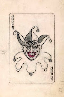
I wanted somebody visually exciting. I wanted somebody that would make an indelible impression, would be bizarre, would be memorable like the Hunchback of Notre Dame or any other villains that had unique physical characters. The other major thing that I realized is as with that a lot of writers, you draw upon your life experiences in some way. Even though at 17 it was limited, I had a life before Batman. In my own family, playing cards played a big role, socially at least. One of my brothers – I had three older brothers –was a lawyer, a Yale graduate, and while he was at college, became a champion bridge player which he continued after college. So cards were always around the house. That’s one influence why I immediately thought of the Joker playing card. What preceded that was that I wanted a villain that had some attribute that was some contradiction in terms, which I feel all great characters have. To make my villain different, to have a sense of humor would be different. That’s how I came upon the name.
Names, of course, are very important. It’s one of the first things we try to associate with a character. At least I did. So once I thought of the villain with a sense of humor, I began to think of a name and the name “the Joker” immediately came to mind. There was the association with the Joker in the deck of cards, and I probably yelled literally, “Eureka!” because I knew I had the name and the image at the same time. I remember searching frantically that night for a deck of cards in my little room in the Bronx where I was holed up and did my work. Luckily I had it and it had somewhat the same image as the classic one, and that was the marriage. That’s how the Joker came into being."
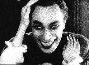
Now it has to be said that both Kane and Finger have taken credit for the Joker's creation, but Kane's testimony was always colored by the need to retain his intellectual stake in Batman. Finger as Batman's primary writer would have been involved in the development of the Joker supplemental to Robinson's groundwork and out of all three of them was the one with the real penchant for movies and had recently seen Conrad Veidt's performance in "The Man Who Laughs" and even provided Robinson and Kane with pictures of Veidt's horrific makeup for the role. Who really created the Joker will always be up for a degree of speculation but my money would be on Robinson.
Robinson's earliest art contributions to Batman were somewhat compromised by the need to retain the Bob Kane house style and so he emulated Kane's wooden figure-work to a tee. But as his confidence grew and as artists like Irwin Hasen and most importantly Mort Meskin (whose fluid artwork would prove an inspirational touchstone for Robinson) dropped around to their 33rd Street apartment to share drawing boards and deadlines, so Robinson's own distinctively lithe and pleasing style begin to assert itself on his Batman assignments.
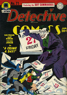
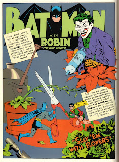
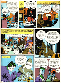
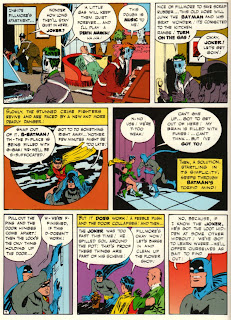
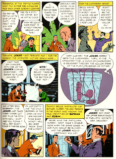
So here's an example of one of Robinson's distinctive Joker stories along with some early covers and his own initial drawing of the first (???) super villain.
All images © DC Comics 2010.
The interview with Robinson can be read in full at the excellent blog "Rocket Llama Headquarters"
When the young Bob Kane successfully pitched the idea of a bat-winged man of mystery to Donenfeld and Liebowitz, he had the advantage of a contractually savvy adviser (Kane senior) to ensure that he continued to hold a significant financial stake in his creation. In truth, Batman was also the creation of Bill Finger, but Kane mindful of the need to keep things as simple and expeditious as possible, treated Finger as very much the junior partner, Finger would eventually die in relative poverty, while Kane transmogrified himself into a minor celebrity, on the back of Batman's success.
Part of the deal which Kane senior extracted from Donenfeld and Liebowitz was that in exchange for relinquishing ownership of Batman, his son's name would become a statutory byline in all appearances of the caped crusader. And as the work load got too intense for any single artist and writer to maintain sole production of the scores of stories required to satiate public demand a host of auxiliary artists had to sign their work with the Bob Kane flourish.
These auxilliaries included the third member of the initial Batman triumvirate, Jerry Robinson who Kane had espied selling ice creams with a hand emblazoned jacket which immediately took Kane's eye. Robinson it was who at the age of 17 joined Kane's production team, sharing an apartment with another DC artist; Bernie Klein over at 33rd Street.
In Robinson's mind the job was going to be a short term way to fund himself through college so that he could pursue his passion for writing and as demand for Batman scripts increased with the near imminent launch of a quarterly Batman comic, he set about the task of writing a story and in doing so created one of the twentieth century's most memorable villains, the Joker.
Robinson put it like this:
"The first thought that I had was to create a villain that was – we didn’t use the word supervillain at that time – a larger-than-life villain, one that would be worthy of Batman. To set the scene, at the time we were just coming from Prohibition and the Depression in the late ‘30s and certainly the early ‘30s when I formulated my whole psyche, so who were the villains at the time? They were the Dillingers, Pretty Boy Floyd, Machinegun Kelly. They were small time bank robbers, embezzlers, hijackers. So those were most of the villains with the few exceptions of the mad scientist here and there in the comics at the time. [From my own studies of literature – English was my major – I knew that all great heroes had some (antagonist) that really tested the hero, everybody from David and Goliath, Bible heroes, to contemporary literature and classics, Sherlock Holmes and Moriarty.] It seems obvious now, but at the time it was thought by a lot of the field that if a villain was too strong – remember, we were focused on Batman, that was the new creation – that the villain would overpower Batman. Well, I had a different view, and I thought Bill was won over as a writer eventually. So that’s what I set out to do: someone who would test Batman and almost be more interesting. I always felt that heroes were essentially dull. Villains were more exotic and could do more interesting things.
I wanted somebody visually exciting. I wanted somebody that would make an indelible impression, would be bizarre, would be memorable like the Hunchback of Notre Dame or any other villains that had unique physical characters. The other major thing that I realized is as with that a lot of writers, you draw upon your life experiences in some way. Even though at 17 it was limited, I had a life before Batman. In my own family, playing cards played a big role, socially at least. One of my brothers – I had three older brothers –was a lawyer, a Yale graduate, and while he was at college, became a champion bridge player which he continued after college. So cards were always around the house. That’s one influence why I immediately thought of the Joker playing card. What preceded that was that I wanted a villain that had some attribute that was some contradiction in terms, which I feel all great characters have. To make my villain different, to have a sense of humor would be different. That’s how I came upon the name.
Names, of course, are very important. It’s one of the first things we try to associate with a character. At least I did. So once I thought of the villain with a sense of humor, I began to think of a name and the name “the Joker” immediately came to mind. There was the association with the Joker in the deck of cards, and I probably yelled literally, “Eureka!” because I knew I had the name and the image at the same time. I remember searching frantically that night for a deck of cards in my little room in the Bronx where I was holed up and did my work. Luckily I had it and it had somewhat the same image as the classic one, and that was the marriage. That’s how the Joker came into being."
Now it has to be said that both Kane and Finger have taken credit for the Joker's creation, but Kane's testimony was always colored by the need to retain his intellectual stake in Batman. Finger as Batman's primary writer would have been involved in the development of the Joker supplemental to Robinson's groundwork and out of all three of them was the one with the real penchant for movies and had recently seen Conrad Veidt's performance in "The Man Who Laughs" and even provided Robinson and Kane with pictures of Veidt's horrific makeup for the role. Who really created the Joker will always be up for a degree of speculation but my money would be on Robinson.
Robinson's earliest art contributions to Batman were somewhat compromised by the need to retain the Bob Kane house style and so he emulated Kane's wooden figure-work to a tee. But as his confidence grew and as artists like Irwin Hasen and most importantly Mort Meskin (whose fluid artwork would prove an inspirational touchstone for Robinson) dropped around to their 33rd Street apartment to share drawing boards and deadlines, so Robinson's own distinctively lithe and pleasing style begin to assert itself on his Batman assignments.
So here's an example of one of Robinson's distinctive Joker stories along with some early covers and his own initial drawing of the first (???) super villain.
All images © DC Comics 2010.
The interview with Robinson can be read in full at the excellent blog "Rocket Llama Headquarters"